Good Samaritan Shelter
Good Samaritan Shelter, the largest provider of homeless services in Santa Barbara County, recognized the need to better serve the growing unhoused population. In response, they expanded their offerings to include a mobile platform focused on improving access to critical resources. The initiative prioritizes accessible design to ensure individuals and families can easily find the support they need.
Role
Product Designer
Timeline
12 weeks; Summer 2025
Team
5 Product Designers
1 Product Manager
2 Engineers
My Role
How might we design a 0→1 accessible mobile app that helps individuals with disabilities exit homelessness by connecting them to essential services?
Impact
100% Increasing in Visibility of 100+ Programs with Santa Barbara
Cut Time-Efficing for Internal staff by 75%

Context
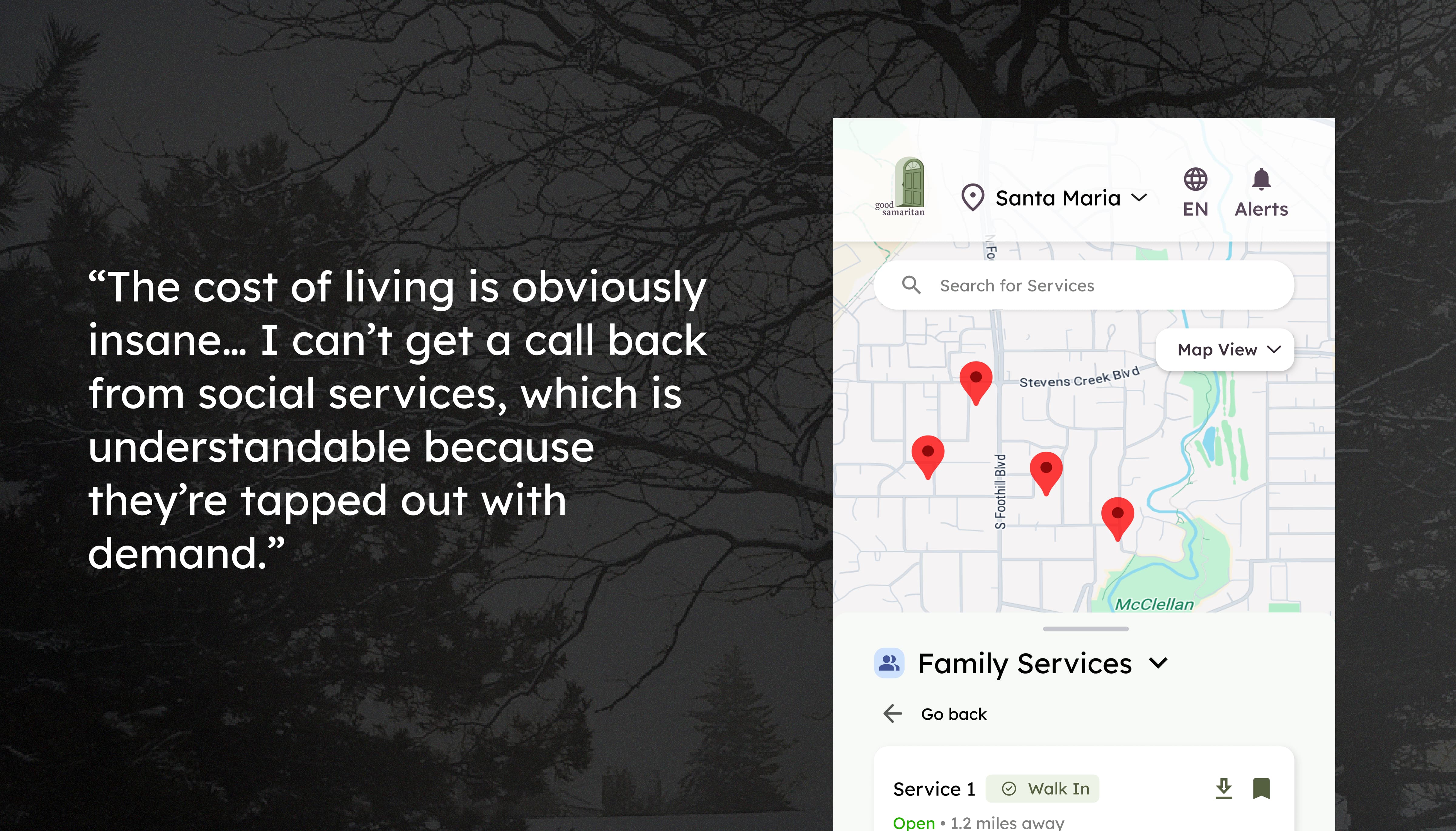
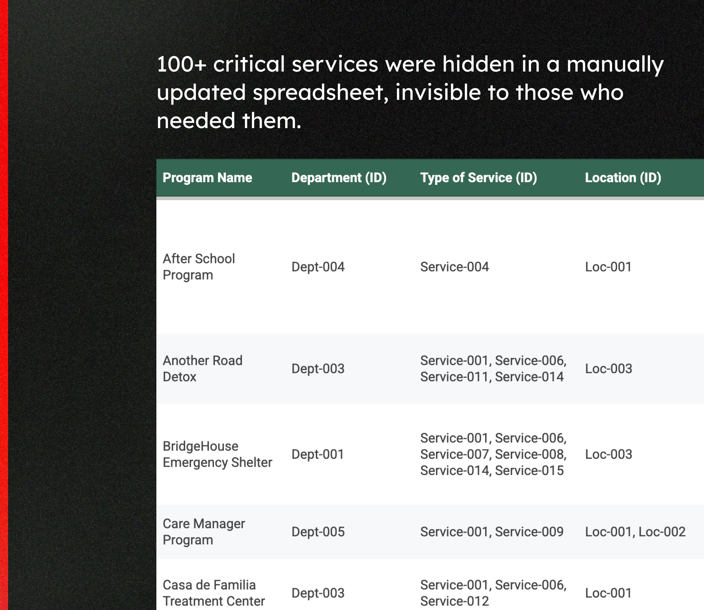
Foundational Gaps in Accessing Resources
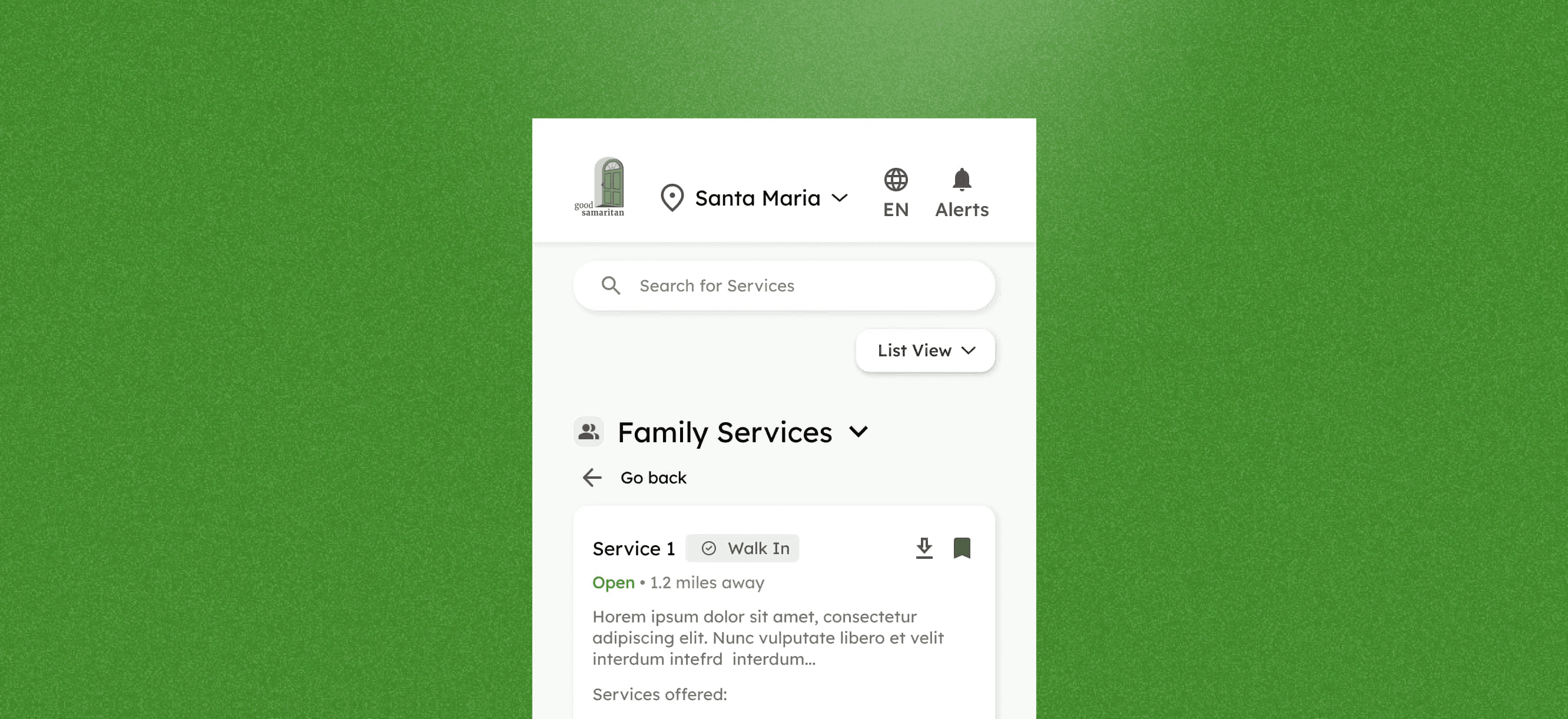
Our goal is to create an inclusive, easy-to-navigate experience that empowers individuals with diverse abilities to access vital resources independently by using sufficient color contrast, supporting screen readers with semantic markup.


Designing for Different Needs
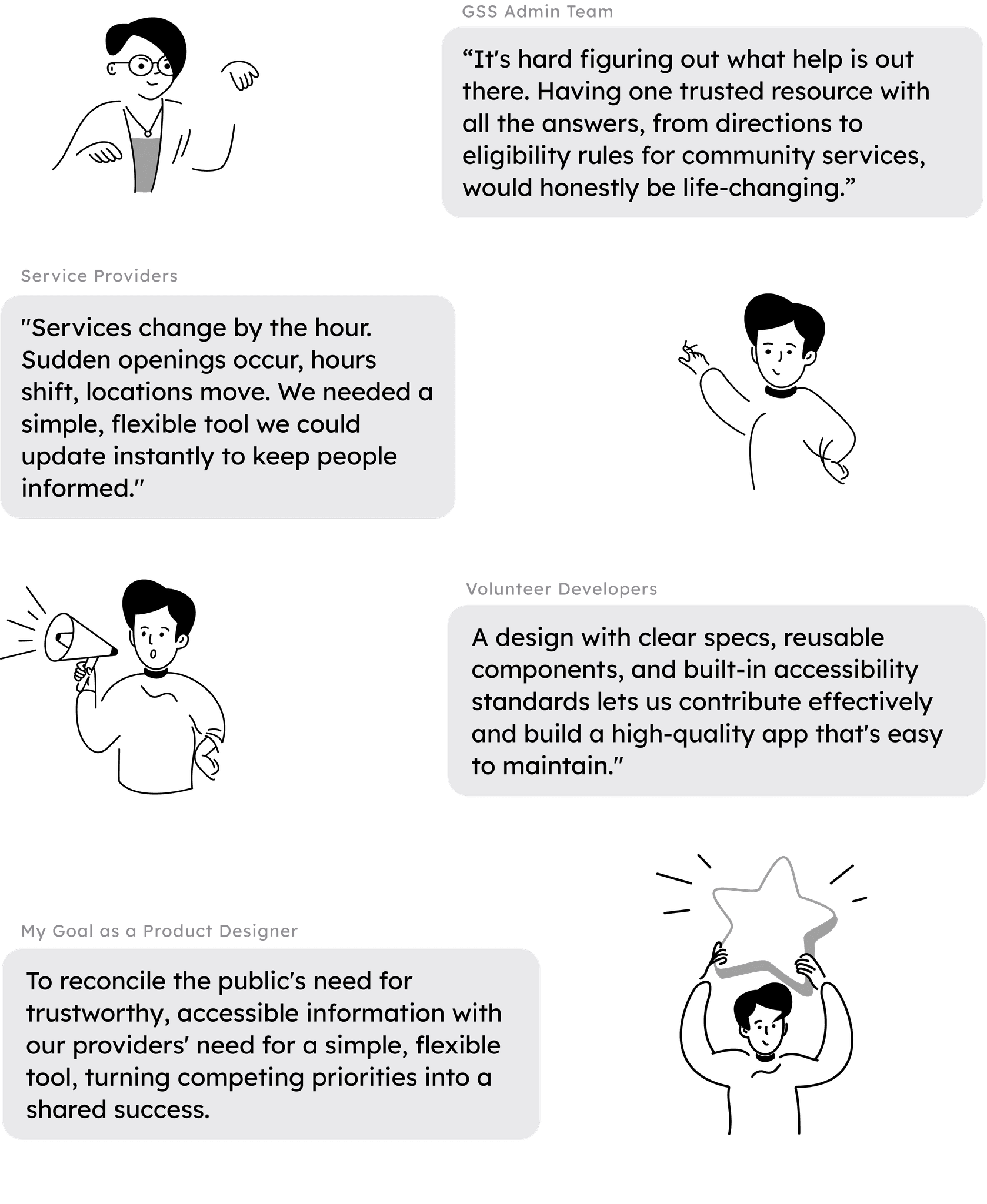
From Technical Hurdles to Stakeholder Buy-In
My primary challenge was to bridge these two perspectives by designing a single solution that served both the public's need for trustworthy information and the provider's need for a simple, flexible tool.


Framing the Opportunity
How might we design a 0→1 accessible mobile app that helps individuals with disabilities exit homelessness by connecting them to essential services?
Ideation
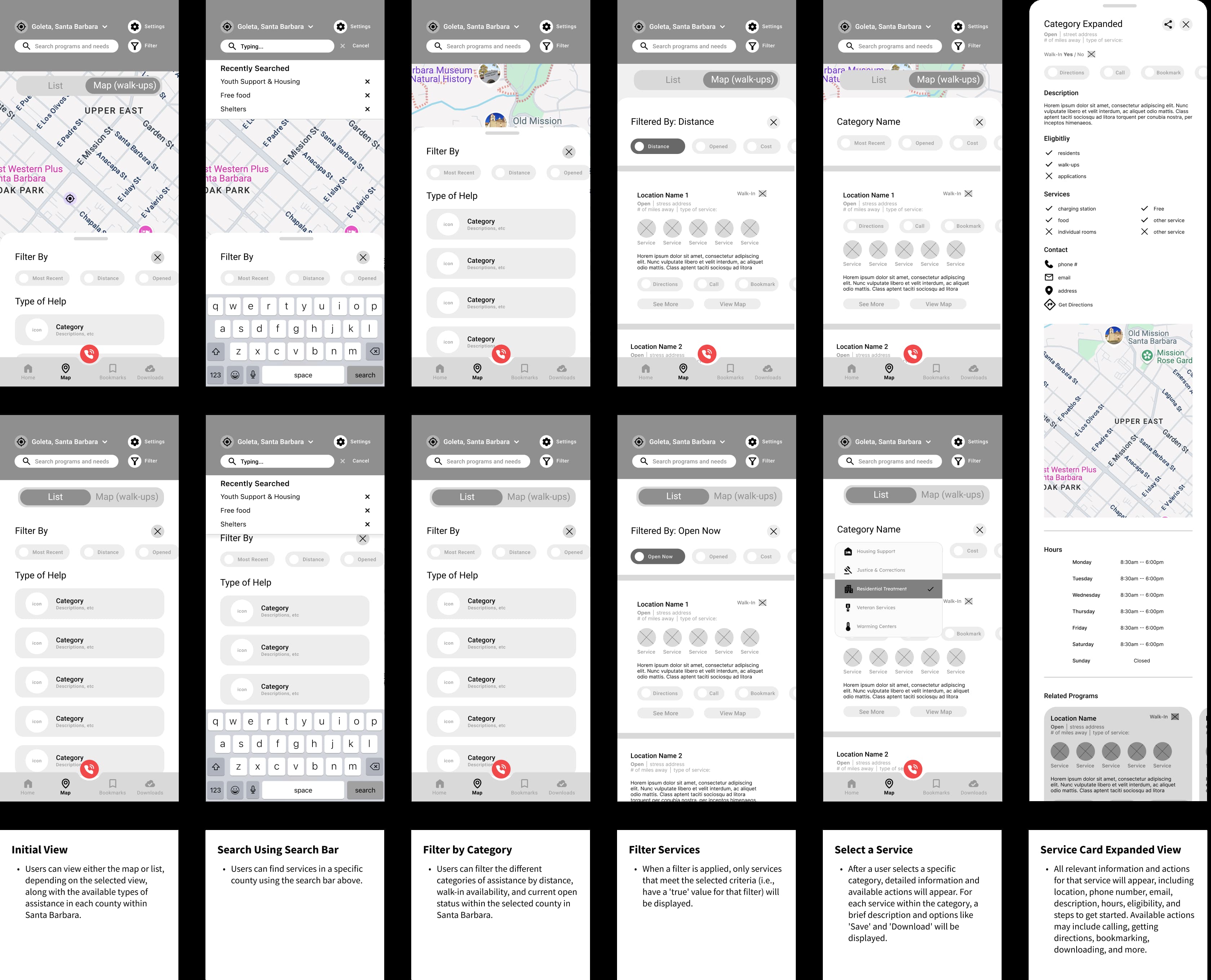
Core Interaction Flows & Information Architecture
Ideation
Usability testing was a key step for each major component of the redesign. For the sake of brevity in this case study, the following deep dive serves as a representative example of our validation process, focusing specifically on the new homepage
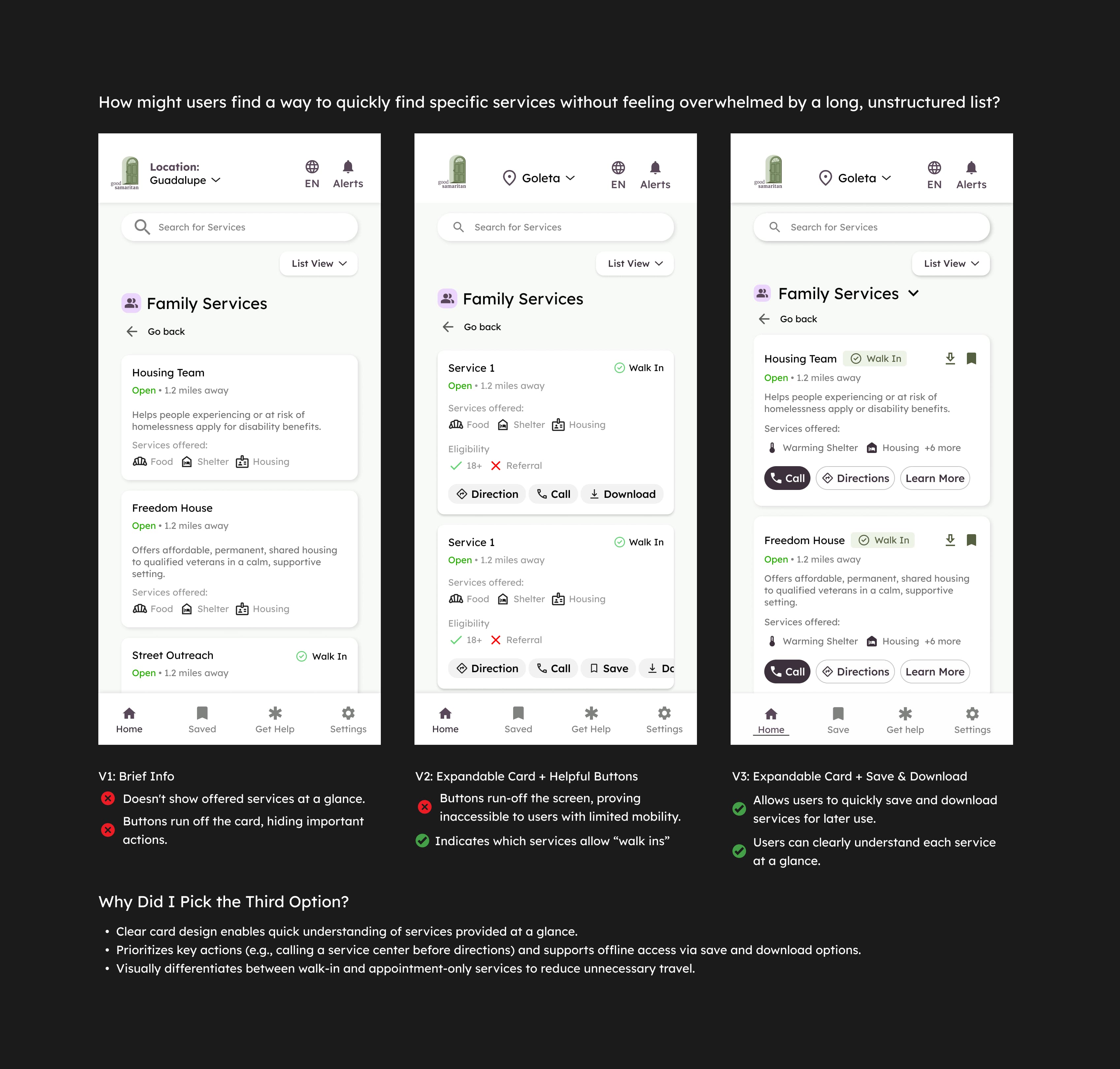
Iteration
Iteratively Prototyping Core Screens
Iterative Prototyping
We created a cohesive brand identity that reflects Medocity’s mission to innovate (thus, the orange) and simplify healthcare by aligning the brand identity with their core values—trust, care, and innovation.

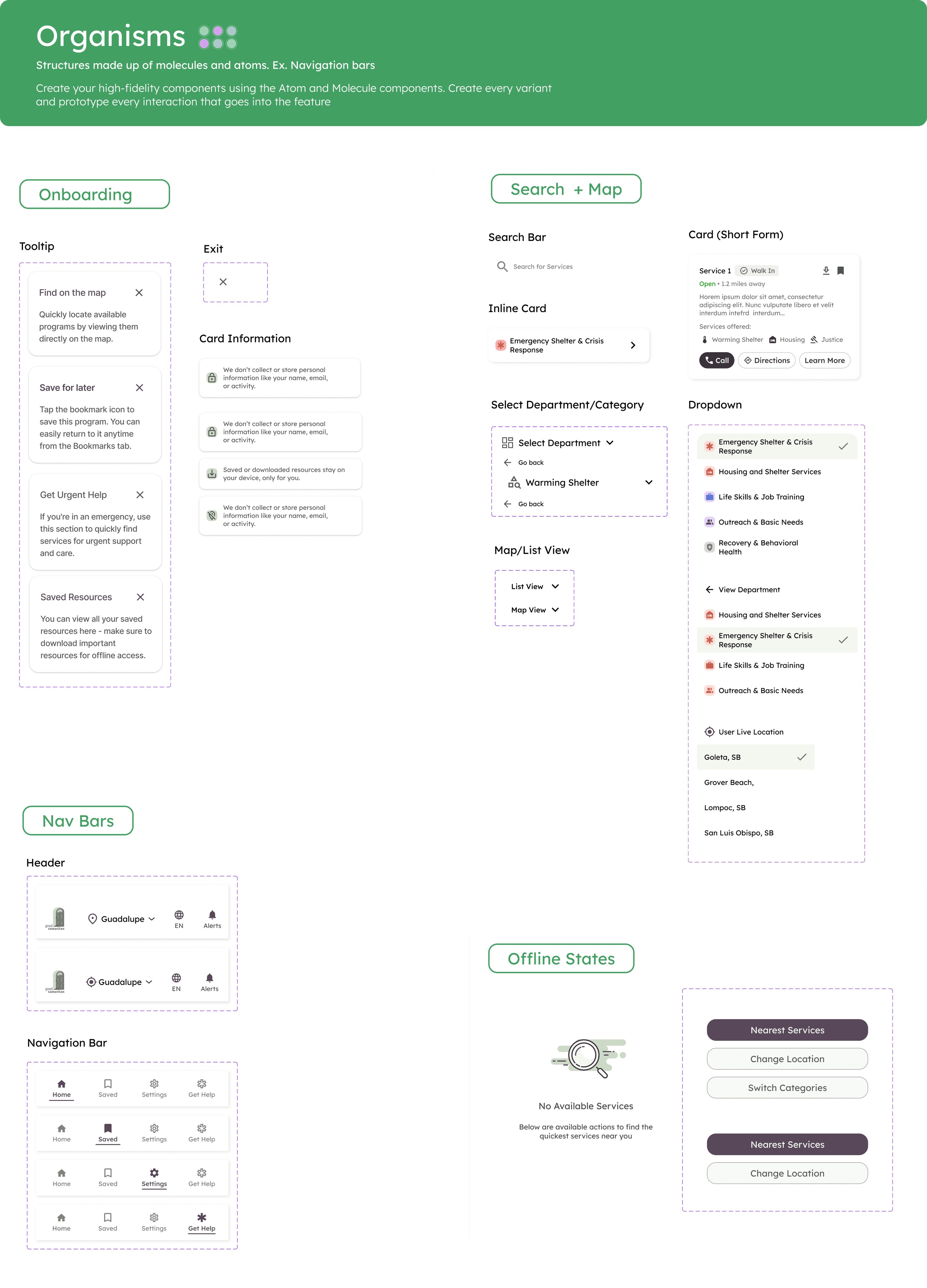
Atoms, Molecules, Organisms
Design System Embedded in Accessibility
The strategic principles and new visual language—including our updated color palette, typography, and interaction patterns—were established with the homepage.

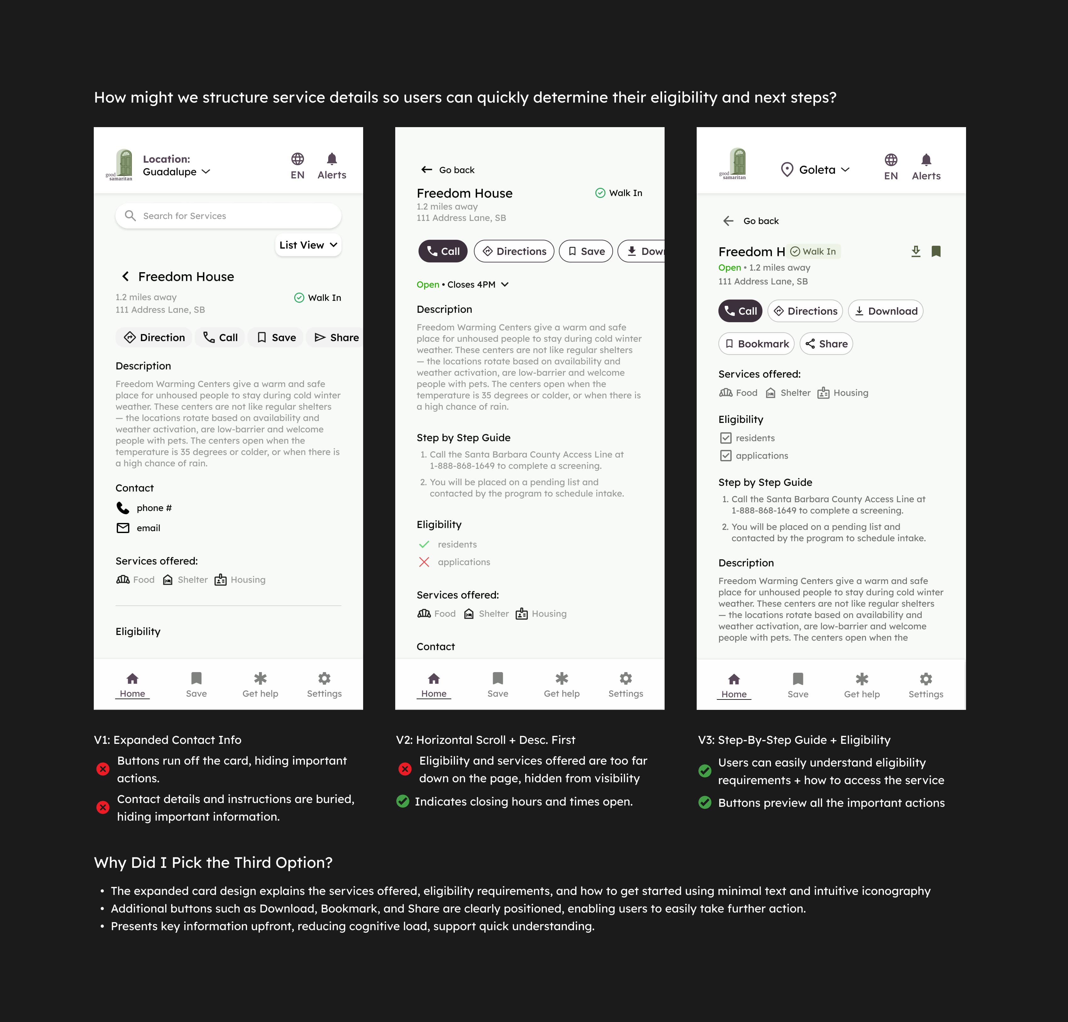
Iteration
Final Prototype
Iterative Prototyping
We created a cohesive brand identity that reflects Medocity’s mission to innovate (thus, the orange) and simplify healthcare by aligning the brand identity with their core values—trust, care, and innovation.
Conclusion
Reflections
User Research
Preparing for Developer Handoff
Our system attached detailed annotations to every screen of the final user flow, with each component labeled under four categories:
Accessibility: ARIA labels, keyboard tab order, and contrast requirements.
Content: Rules for dynamic fields, character limits, and text wrapping.
Interaction: Micro-interactions, animation timing/curves, and state definitions (hover, pressed, disabled, loading).
Development: Redline specs for spacing, typography, colors, and linked assets.