Thumbnail image

Designing an End-to-End Search Experience for 5000+ Users

Designing an End-to-End Search Experience for 5000+ Users

Designing an End-to-End Search Experience for 5000+ Users

Our team functioned as a zero to one incubator to solve a critical gap in social equity: while the Good Samaritan Shelter is Santa Barbara County's largest public service provider, their legacy platform was a barrier rather than a bridge. We identified that for 5,000+ individuals, the complexity of navigating housing and shelter resources was compounded by a "desktop-first" design in a "mobile-only" reality. To tackle this, we built a mobile-first, offline-friendly core discovery flow with AI search to make finding the right resources much faster and easier.

Our team functioned as a zero to one incubator to solve a critical gap in social equity: while the Good Samaritan Shelter is Santa Barbara County's largest public service provider, their legacy platform was a barrier rather than a bridge. We identified that for 5,000+ individuals, the complexity of navigating housing and shelter resources was compounded by a "desktop-first" design in a "mobile-only" reality. To tackle this, we built a mobile-first, offline-friendly core discovery flow with AI search to make finding the right resources much faster and easier.

Our team functioned as a zero to one incubator to solve a critical gap in social equity: while the Good Samaritan Shelter is Santa Barbara County's largest public service provider, their legacy platform was a barrier rather than a bridge. We identified that for 5,000+ individuals, the complexity of navigating housing and shelter resources was compounded by a "desktop-first" design in a "mobile-only" reality. To tackle this, we built a mobile-first, offline-friendly core discovery flow with AI search to make finding the right resources much faster and easier.

Role

Product Designer

Team

2 Product Designers

1 Product Manager

2 Engineers

Timeline

May 2025 - Aug 2025

Tools

Figma

Claude

Midjourney (Image Generation)

My Role

I was involved throughout the entire design process, from ideation to high-fidelity solutions, but specifically led the design of the homepage and AI search tool, translating ambiguous user needs into user-friendly experiences through close collaboration with engineers and stakeholders. To ensure the product could scale, I also contributed to a comprehensive, WCAG-AA compliant design system, prioritizing inclusive interaction patterns.

Impact

100% task completion rate across 6 key tasks during usability testing with 13 participants

Connects 450+ resources across 6 cities in Santa Barbara County

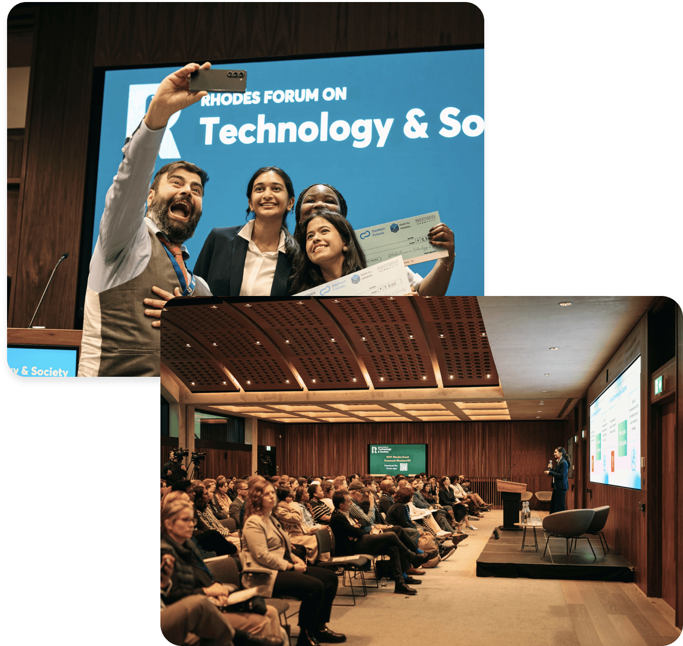
$10k Equitech Ventures Grand Prize Winner

Existing Barriers to Housing and Shelter Resources

For more than 5,000 people in Santa Barbara County, finding housing and shelter resources is frustrating and time-consuming. The existing platform was designed for desktop use and relied on constant internet access— something many users didn’t have. This meant people couldn’t quickly find the help they needed, creating unnecessary delays, confusion, and stress in an already difficult situation.

For more than 5,000 people in Santa Barbara County, finding housing and shelter resources is frustrating and time-consuming. The existing platform was designed for desktop use and relied on constant internet access— something many users didn’t have. This meant people couldn’t quickly find the help they needed, creating unnecessary delays, confusion, and stress in an already difficult situation.

For more than 5,000 people in Santa Barbara County, finding housing and shelter resources is frustrating and time-consuming. The existing platform was designed for desktop use and relied on constant internet access— something many users didn’t have. This meant people couldn’t quickly find the help they needed, creating unnecessary delays, confusion, and stress in an already difficult situation.

FIG 1: THE LEGACY DESKTOP-ONLY WEBSITE WAS DIFFICULT TO NAVIGATE

Key Findings from User Research

Key Findings from User Research

To better understand the scope of the challenge, we began by interviewing 5 formerly unhoused GSS volunteers and surveyed 68 staff members. This revealed 3 key barriers preventing users from accessing the help they needed.

To better understand the scope of the challenge, we began by interviewing 5 formerly unhoused GSS volunteers and surveyed 68 staff members. This revealed 3 key barriers preventing users from accessing the help they needed.

Uncovering Key Barriers to Access

To better understand the scope of the challenge, we began by interviewing 5 formerly unhoused GSS volunteers and surveyed 68 staff members. This revealed 3 key barriers preventing users from accessing the help they needed.

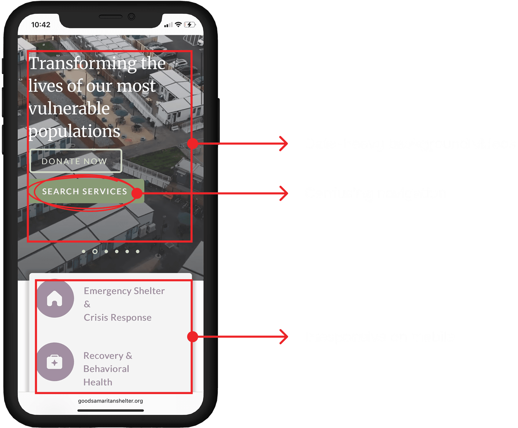
Existing online shelter e

Pain Point 1: The Gap for Visually Impaired Users

Pain Point 1: The Gap for Visually Impaired Users

Pain Point 1: The Gap for Visually Impaired Users

Existing online shelter resources often overlooked visual accessibility. Without readable typefaces and adequate color contrast, visually impaired users face significant barriers navigating and accessing critical information.

Existing online shelter resources often overlooked visual accessibility. Without readable typefaces and adequate color contrast, visually impaired users face significant barriers navigating and accessing critical information.

Existing online shelter resources often overlooked visual accessibility. Without readable typefaces and adequate color contrast, visually impaired users face significant barriers navigating and accessing critical information.

Pain Point 2: Connectivity Barriers

Pain Point 2: Connectivity Barriers

Pain Point 2: Connectivity Barriers

Many users relied on government-issued android phones with limited data and unstable Wi-Fi. The original website's need for a data-heavy connection often caused it to fail to load or function properly on low-connectivity devices.

Many users relied on government-issued android phones with limited data and unstable Wi-Fi. The original website's need for a data-heavy connection often caused it to fail to load or function properly on low-connectivity devices.

Many users relied on government-issued android phones with limited data and unstable Wi-Fi. The original website's need for a data-heavy connection often caused it to fail to load or function properly on low-connectivity devices.

Pain Point 3: Information Overload & Distrust

Pain Point 3: Information Overload & Distrust

Pain Point 3: Information Overload & Distrust

Information on existing digital services was often outdated or inaccurate, making the search frustrating, eroding trust in online tools. As a result, many users gave up on using online resources altogether.

Information on existing digital services was often outdated or inaccurate, making the search frustrating, eroding trust in online tools. As a result, many users gave up on using online resources altogether.

Information on existing digital services was often outdated or inaccurate, making the search frustrating, eroding trust in online tools. As a result, many users gave up on using online resources altogether.

Studying Existing Solutions to Inform Design Decisions

Next, we conducted a competitor analysis of apps like OurCalling and Nextdoor to understand how different platforms present information and build user confidence. We focused on design patterns such as map views, list views, ratings, and real-time updates, identifying strategies that make interactions feel transparent, reliable, and easy to understand.

FIG 2: KEY PLATFORMS WE ANALYZED DURING COMPETITIVE ANALYSIS

Defining Key Product Constraints

Studying competitors highlighted design strategies that improve usability and trust, but we also had to account for the realities of our users’ environment. Many rely on mobile devices with limited or unreliable connectivity, so I designed offline-first flows that prioritized essential actions and cached critical data where feasible. This ensured the product reduced the risk of failure during critical moments.

Identifying Key Opportunity Area

While offline-first design ensured the platform remained reliable under unstable network conditions, we also saw an opportunity to improve how users interact with information in high-stress situations. Our user research and competitive analysis showed that many existing apps rely on one-time interactions, leaving users to figure out next steps on their own. To address this, we explored AI solutions that lower the barrier to entry, turning unstructured user stories into actionable next steps.

While offline-first design ensured the platform remained reliable under unstable network conditions, we also saw an opportunity to improve how users interact with information in high-stress situations. Our user research and competitive analysis showed that many existing apps rely on one-time interactions, leaving users to figure out next steps on their own. To address this, we explored AI solutions that lower the barrier to entry, turning unstructured user stories into actionable next steps.

While offline-first design ensured the platform remained reliable under unstable network conditions, we also saw an opportunity to improve how users interact with information in high-stress situations. Our user research and competitive analysis showed that many existing apps rely on one-time interactions, leaving users to figure out next steps on their own. To address this, we explored AI solutions that lower the barrier to entry, turning unstructured user stories into actionable next steps.

FIG 3: HIGH-FIDELITY PROTOTYPES OF THE AI SEARCH FEATURE

Rapid Concept Exploration Using AI

To accelerate concept exploration under tight time constraints, I leveraged AI tools like Claude and Sitch AI to rapidly generate and iterate on design ideas. This allowed me to quickly test a wide range of concepts and identify promising directions without getting bogged down in manual sketching, ensuring the team could focus our time on refining solutions that aligned with user needs.

To accelerate concept exploration under tight time constraints, I leveraged AI tools like Claude and Sitch AI to rapidly generate and iterate on design ideas. This allowed me to quickly test a wide range of concepts and identify promising directions without getting bogged down in manual sketching, ensuring the team could focus our time on refining solutions that aligned with user needs.

To accelerate concept exploration under tight time constraints, I leveraged AI tools like Claude and Sitch AI to rapidly generate and iterate on design ideas. This allowed me to quickly test a wide range of concepts and identify promising directions without getting bogged down in manual sketching, ensuring the team could focus our time on refining solutions that aligned with user needs.

FIG 4: A SUBSECTION OF THE WIDE RANGE OF CONCEPTS WE TESTED USING STICH AI

Iterating on Our Designs Based on User Testing

Given our user considerations, we decided to developed an inclusive, offline-first user flow from landing on the homepage to locating or discovering a service, restructuring fragmented municipal data into a reliable, intuitive experience.

Filter-First Layout

Has a map/list view toggle (visual search vs. list search)

High cognitive load (i.e wall of controls/filters)

No primary action

Organized by Categories

Establishes a clear, predictable navigation path

Organizes similar services under a single category

No primary actions like "Call" or "Directions"

Guided-Discovery Layout

Users can discover services through categories or browse "Services Near You"

Has secondary filters

Users can easily scan the name, status and primary actions

Expanded Card Pop-Up

Groups key information into logical, collapsible sections

Caseworkers noted that important details are buried

No clear primary action

Single-Column Details Page

Has a full page view for expanded service details

Clear actions in the easy-to-access section at the top.

Still is hard to scan for our users

Easy-to-Scan Details Page

Highly scannable cards

Builds users' trust with an entrance photo, confirming the location is safe to approach.

Uses progressive disclosure by hiding secondary info

Pre-Filtered Smart Search

Relevant filters like sort by "Distance" and "Type of Help"

Users don't like complex filter decisions pre-search

Users think "Type of Help" UI is complex and unclear

Integrated Search

No complicate pre-search filter barrier

The service card competes with the search dropdown

Accidental conflicting touch targets for many users

Conversational AI Search

Separates search into its own view

Provides three distinct search paths (Keyword, Category, AI)

Positions AI as a conversational path to an answer

Specs & Documentation for Handoff

To ensure smooth implementation, I created comprehensive documentation including annotated screens with design rationale from our iterative testing, development-ready assets with clear naming conventions, and detailed accessibility specifications for WCAG AA compliance (color contrast ratios, touch target sizes, screen reader labels, and focus order).

FIG 5: SAMPLE ANNOTATED FIGMA HANDOFFS ANNOTATED WITH SPECS

Our Final Solution

These prototypes brings all the solutions together into a single, cohesive experience. Our design and user flow is intentionally simple, prioritizing speed, visual accessibility, and clarity to meet the needs of a user in crisis.

These prototypes brings all the solutions together into a single, cohesive experience. Our design and user flow is intentionally simple, prioritizing speed, visual accessibility, and clarity to meet the needs of a user in crisis.

These prototypes brings all the solutions together into a single, cohesive experience. Our design and user flow is intentionally simple, prioritizing speed, visual accessibility, and clarity to meet the needs of a user in crisis.

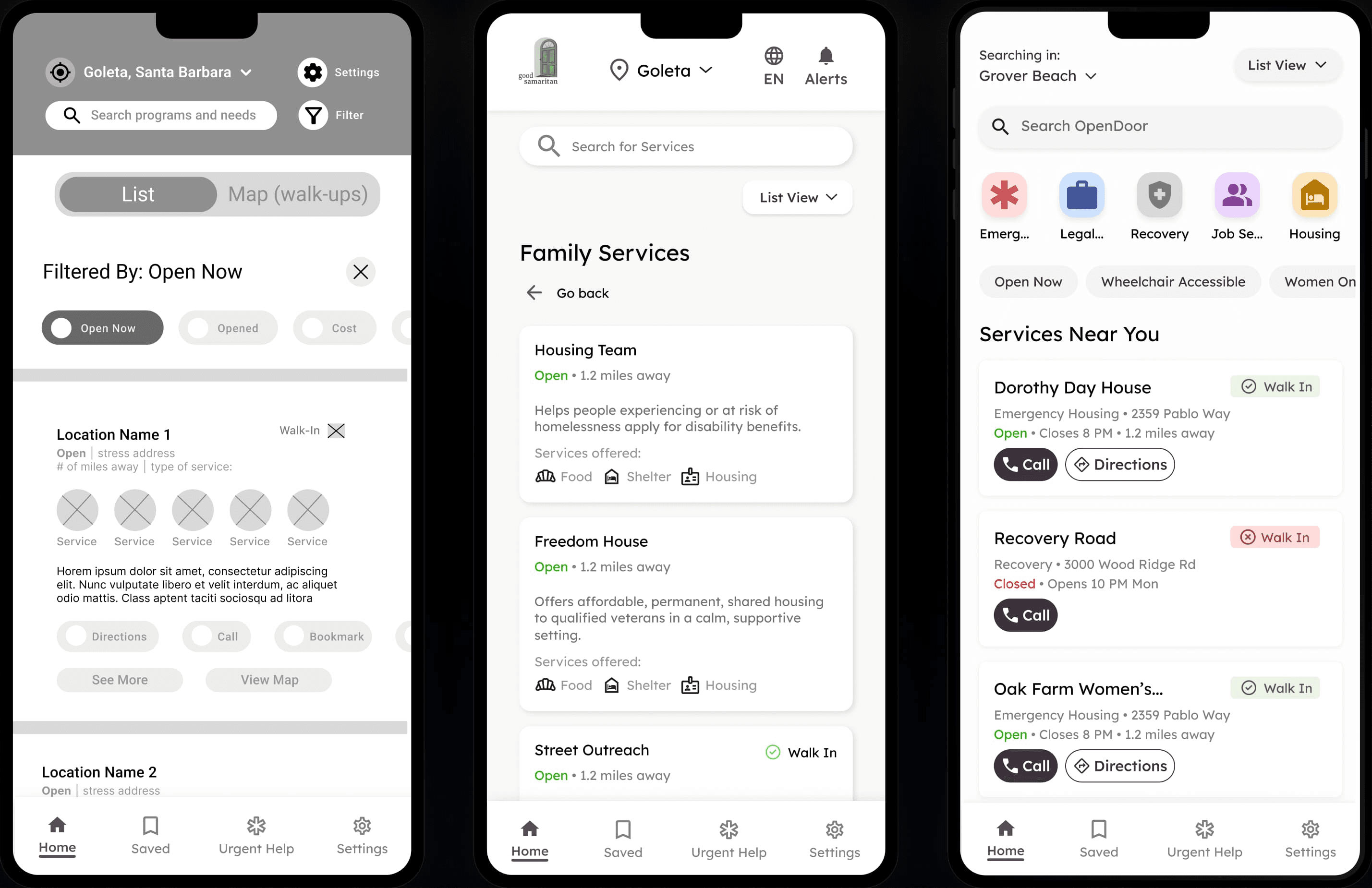
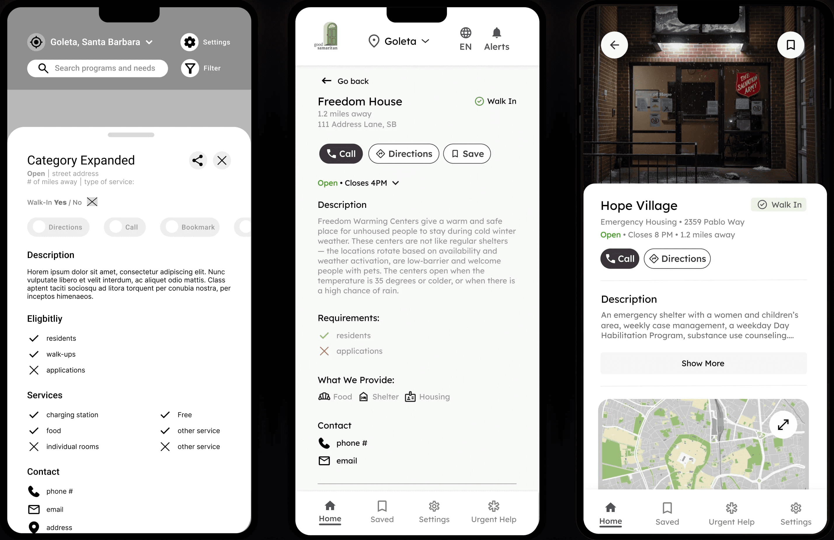
Core Discovery: Reducing Friction in High-Stress Situations

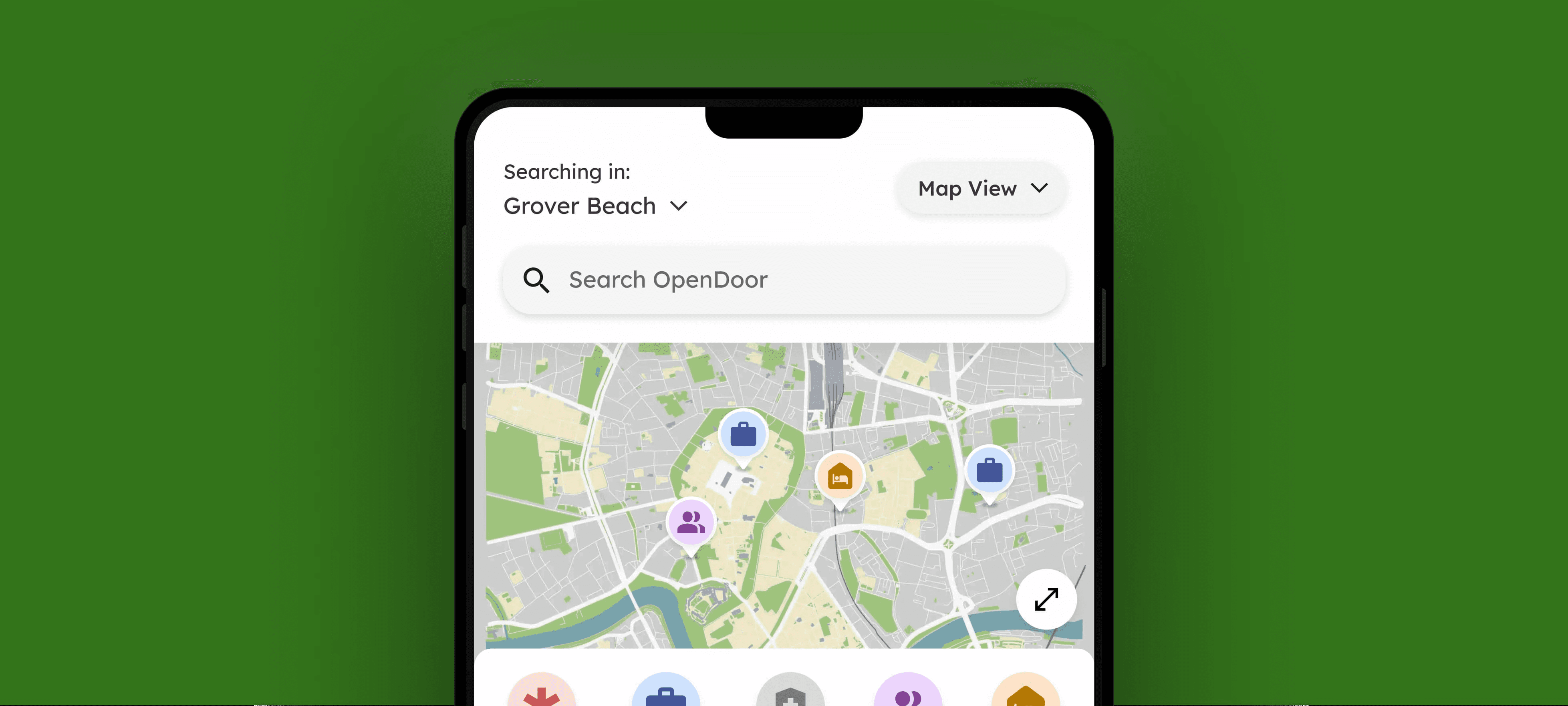
This prototype validates the core user flow, from searching and filtering resources on the list view to viewing expanded service details and saving it for later access.

Conversational AI: Lowering the Barrier to Entry

This prototype tests the conversational, AI search flow. From the Map view, users tap the search bar, choose “Conversational Search,” and ask for help naturally (e.g., “I need a place to sleep tonight”). The system then returns the most relevant services, bypassing traditional filters.

This prototype tests the conversational, AI search flow. From the Map view, users tap the search bar, choose “Conversational Search,” and ask for help naturally (e.g., “I need a place to sleep tonight”). The system then returns the most relevant services, bypassing traditional filters.

This prototype tests the conversational, AI search flow. From the Map view, users tap the search bar, choose “Conversational Search,” and ask for help naturally (e.g., “I need a place to sleep tonight”). The system then returns the most relevant services, bypassing traditional filters.

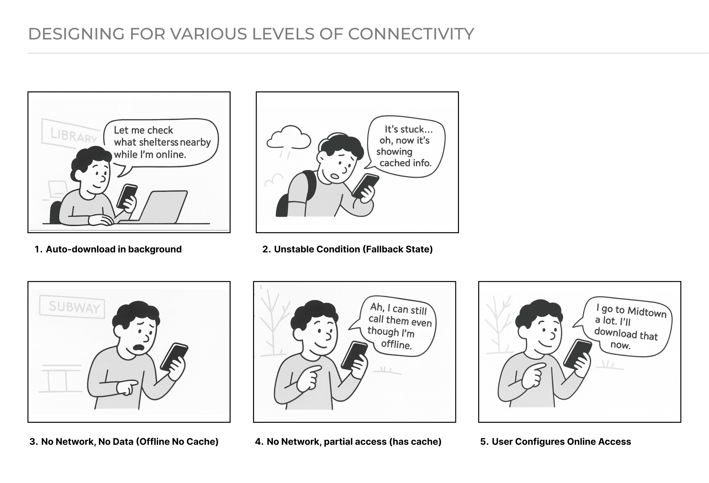
Offline Mode: Designing for Environmental Constraints

This prototype demonstrates how the app supports users with limited or no internet access. When “Low-Data Mode” is enabled in Settings, the app switches to a list-only view showing cached service data. The UI then directs users to their locally stored “Saved Resources,” accessible even offline.

This prototype demonstrates how the app supports users with limited or no internet access. When “Low-Data Mode” is enabled in Settings, the app switches to a list-only view showing cached service data. The UI then directs users to their locally stored “Saved Resources,” accessible even offline.

This prototype demonstrates how the app supports users with limited or no internet access. When “Low-Data Mode” is enabled in Settings, the app switches to a list-only view showing cached service data. The UI then directs users to their locally stored “Saved Resources,” accessible even offline.

A Scalable Design System

To build a scalable, inclusive experience for users with visual impairments, we developed a WCAG AA-compliant design system featuring high-contrast colors, large typography, and larger-than-normal touch targets to improve readability and ease of use.

Expanding to Bay Area and Boston

Building on our work with Santa Barbara’s largest nonprofit, we are now scaling our app to meet a national need. Under the guidance of my project manager, we have expanded into active pilots in Los Angeles and Boston. This growth is currently supported by 20+ organizations, including Boston Health Care for the Homeless.

What I Learned

Navigating Ambiguity to Ship a Product Under Real-World Constraints

This project required designing without clear requirements, reliable infrastructure, or a single “primary” user. I learned how to distill a complex, high-stakes problem into a small set of decisive product bets, rapidly prototype against them, and align stakeholders around what to build first.

This project required designing without clear requirements, reliable infrastructure, or a single “primary” user. I learned how to distill a complex, high-stakes problem into a small set of decisive product bets, rapidly prototype against them, and align stakeholders around what to build first.

This project required designing without clear requirements, reliable infrastructure, or a single “primary” user. I learned how to distill a complex, high-stakes problem into a small set of decisive product bets, rapidly prototype against them, and align stakeholders around what to build first.

Rapidly Iterating from Zero to a Functional Product

Starting from an outdated system with no mobile strategy, I learned how to move quickly from problem framing to mock prototypes, test assumptions early, and iterate toward a shippable end-to-end experience under tight constraints.

Starting from an outdated system with no mobile strategy, I learned how to move quickly from problem framing to mock prototypes, test assumptions early, and iterate toward a shippable end-to-end experience under tight constraints.

Starting from an outdated system with no mobile strategy, I learned how to move quickly from problem framing to mock prototypes, test assumptions early, and iterate toward a shippable end-to-end experience under tight constraints.

Have a project in mind?

Radically Curious.
Learning by Doing.
With Love, Always.

Have a project in mind?

Radically Curious.
Learning by Doing.
With Love, Always.