Good Samaritan Shelter
Good Samaritan Shelter is the largest nonprofit and social service provider in Santa Barbara County, offering housing and support services to 5,000+ vulnerable individuals across six cities. My team designed an end-to-end search experience that transformed their previously outdated website, which was difficult to maintain and had limited reach, into digital mobile tool.
Role
Product Designer
Timeline
May 2025 - Aug 2025
Team
4 Product Designers
1 Product Manager
2 Engineers
Problem
How might we help people experiencing homelessness in Santa Barbara County access and navigate fragmented social services through an accessible, offline-friendly mobile experience?
Impact
Set to deploy in Spring 2026, the app is projected to reduce search time by 60%, based on usability testing conducted with 11+ formerly houseless volunteers, intending to serve more than 5,000+ individuals across Santa Barbara County.
An Overview
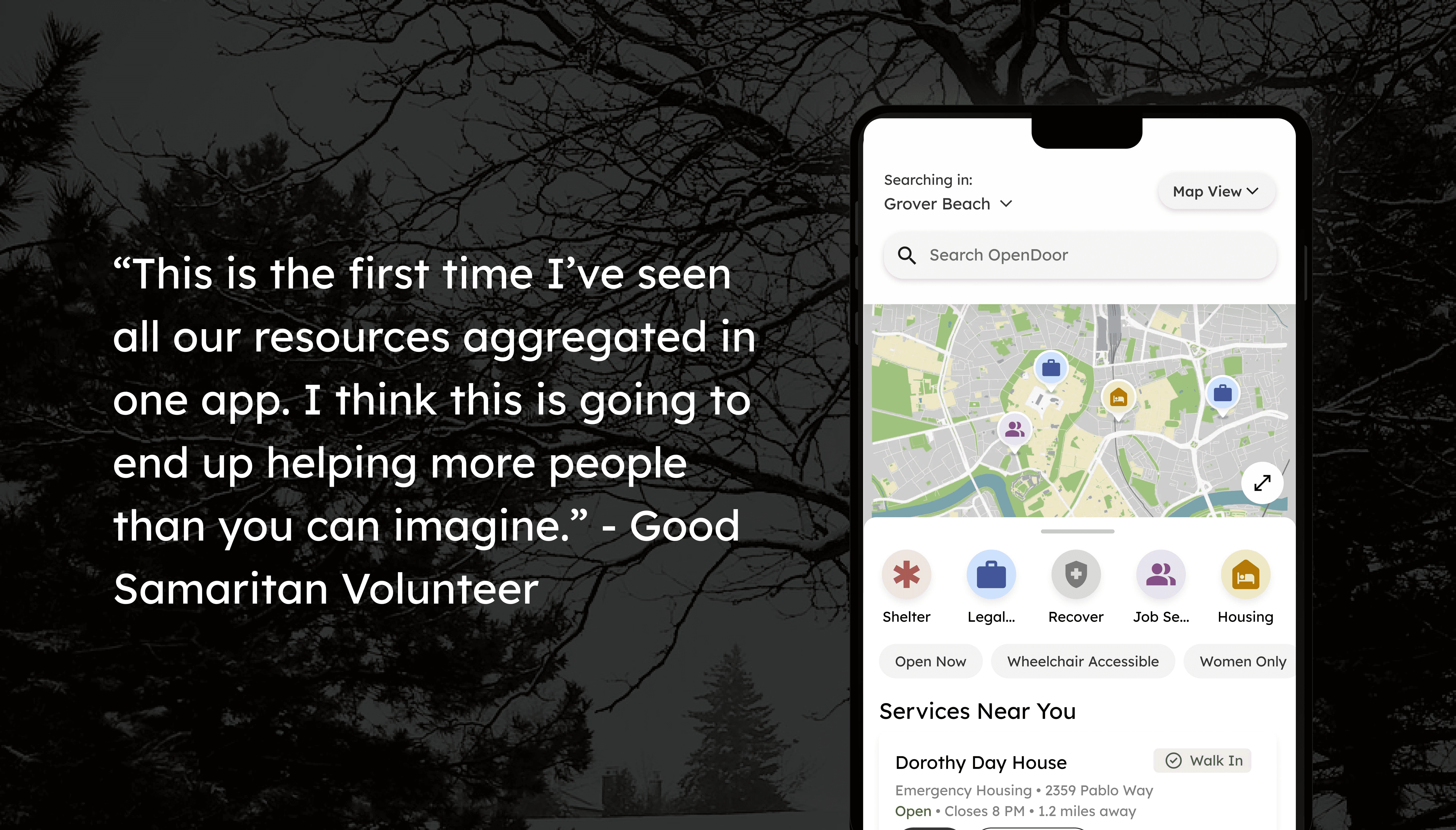
The Good Samaritan app provides users in crisis with direct answers to vital needs. It uses an AI-powered search to understand natural language, while the List and Map views offer clear, structured ways to discover services. Key information can also be later saved for reliable offline access.
The Context
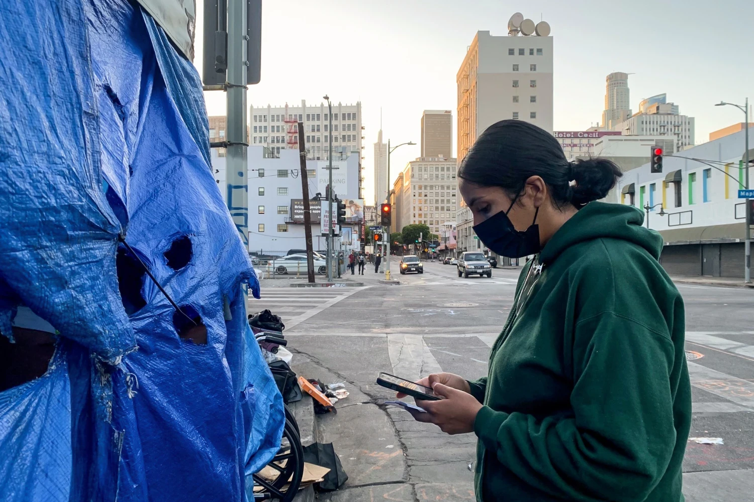
For over 5,000 individuals in Santa Barbara County, accessing housing and other essential services remains a daily challenge. The existing resource, a web platform managed by the Good Samaritan Shelter, required internet and computer access that many users lacked. To bridge the gap, our team developed an end-to-end experience to make it much easier to access these critical services.
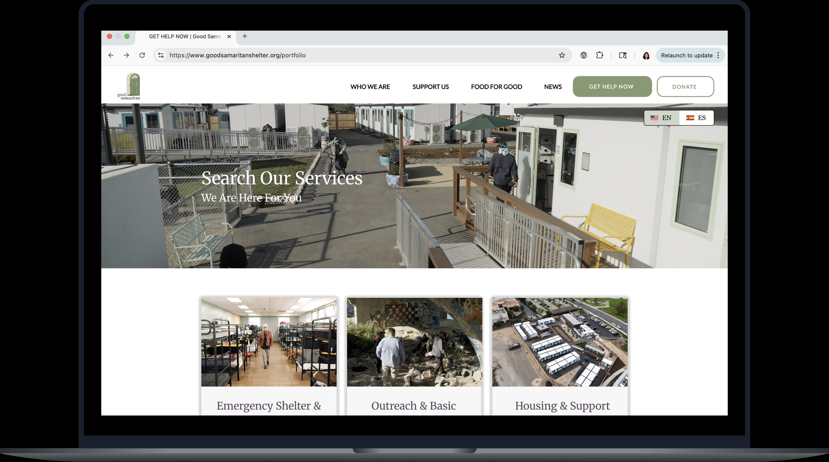
Existing online shelter e
Pain Point 1: The Gap for Visually Impaired Users
Existing online shelter resources often overlooked visual accessibility. Without readable typefaces and adequate color contrast, visually impaired users face significant barriers navigating and accessing critical information.
Pain Point 2: Connectivity Barriers
Many users relied on government-issued android phones with limited data and unstable Wi-Fi. The original website's need for a data-heavy connection often caused it to fail to load or function properly on low-connectivity devices.
Pain Point 3: Information Overload & Distrust
Information on existing digital services was often outdated or inaccurate, making the search frustrating, eroding trust in online tools. As a result, many users gave up on using online resources altogether.
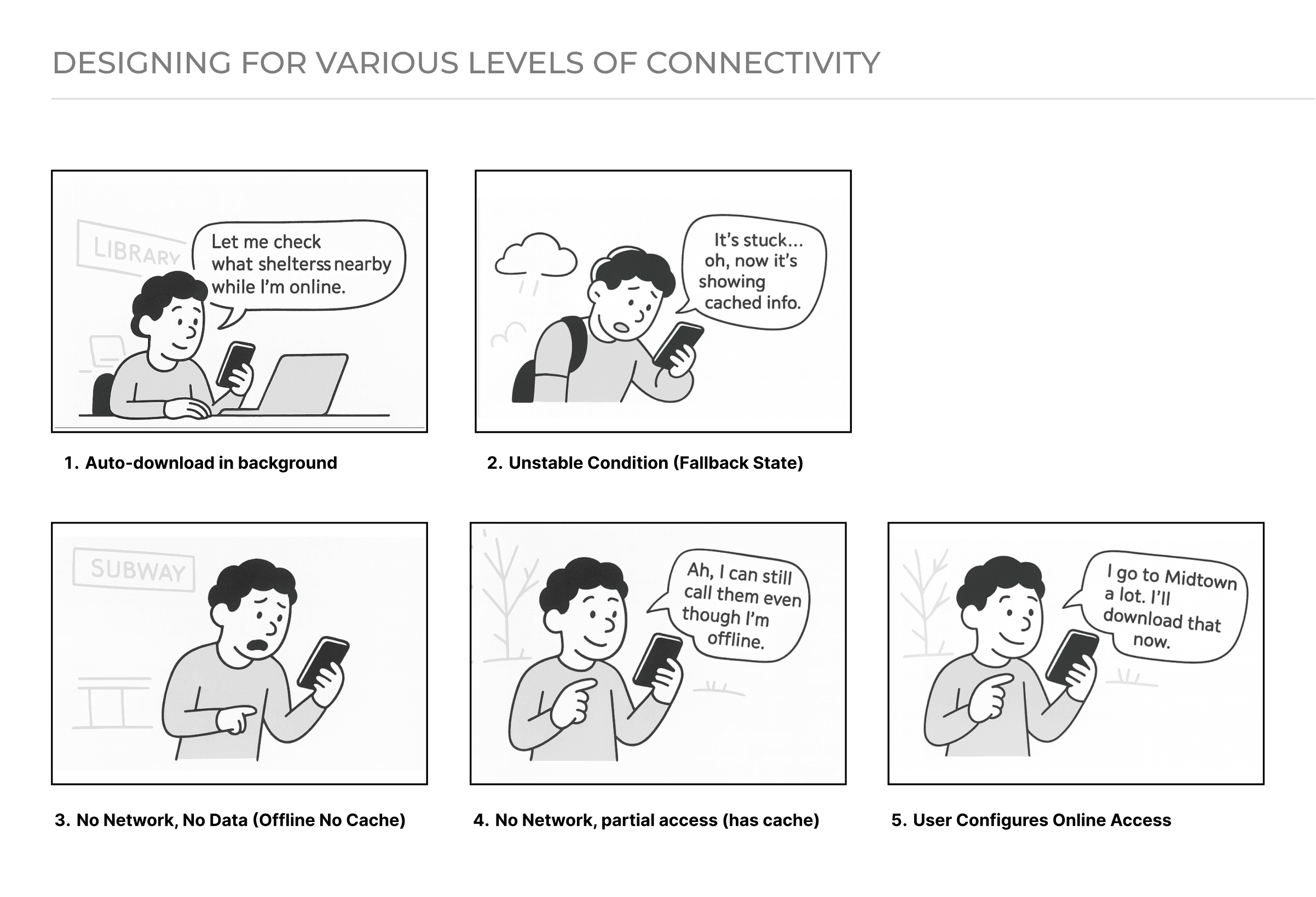
An Offline-First Experience to Bridge the Connectivity Barrier
Because many of our users experience unstable housing, I advocated and designed for an offline-first experience that stays functional in poor network conditions using caching (whenever possible) because for users with unreliable internet, a heavy, slow-loading app can be a dead end. See the third prototype below for a detailed exploration of how I designed for this.
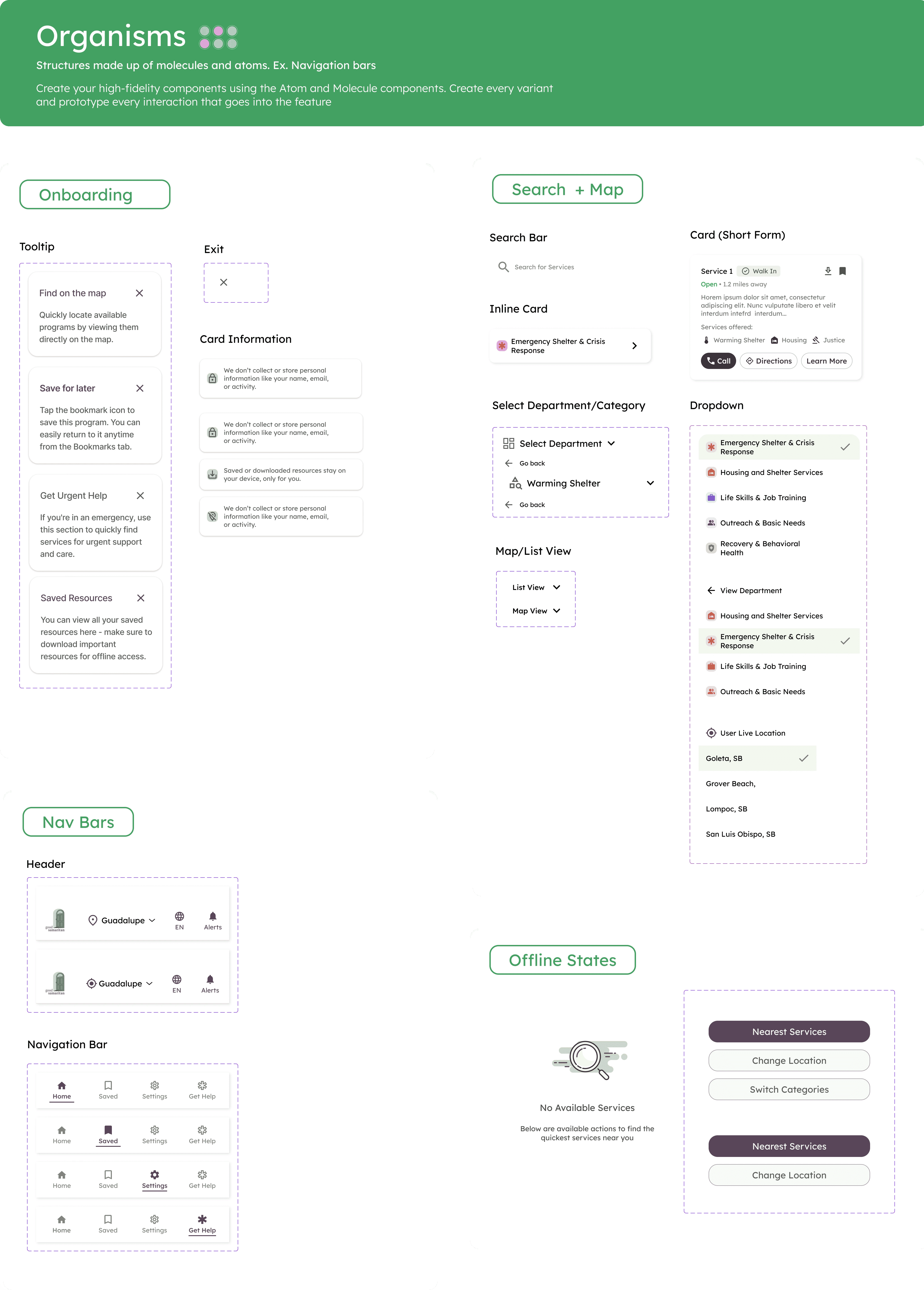
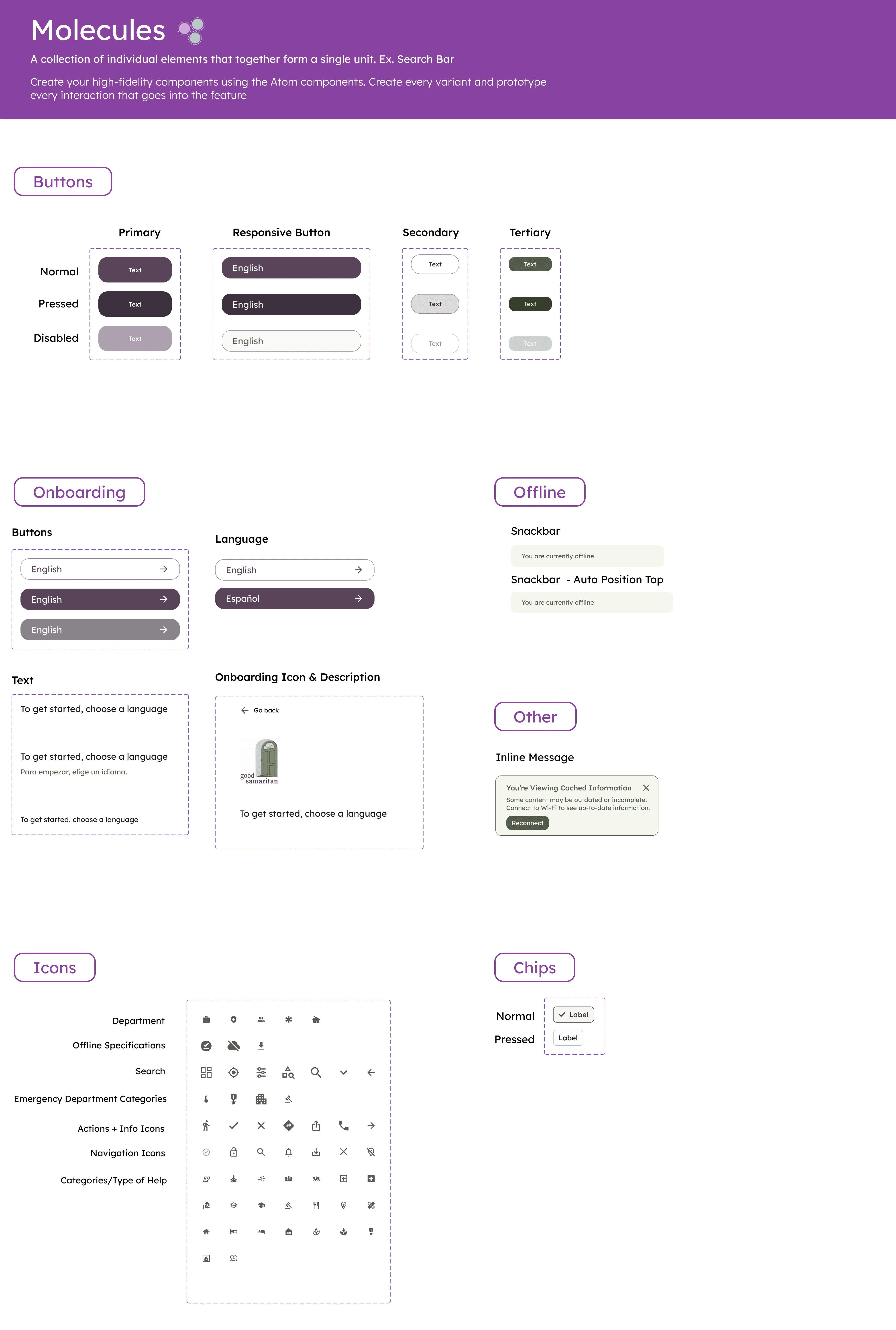
An Inclusive Design System to Reduce Cognitive Overload
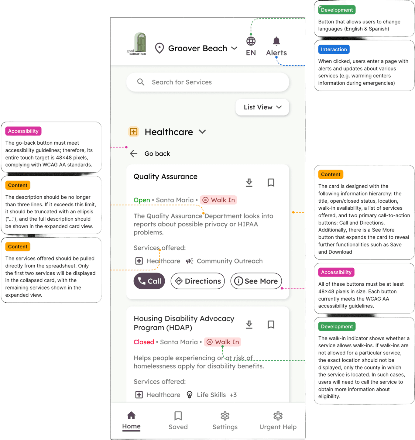
To build an inclusive experience for users with visual impairments, we focused on reducing cognitive overload. We developed a WCAG AA-compliant design system featuring high-contrast colors, large typography, and larger-than-normal touch targets to improve readability and ease of use.

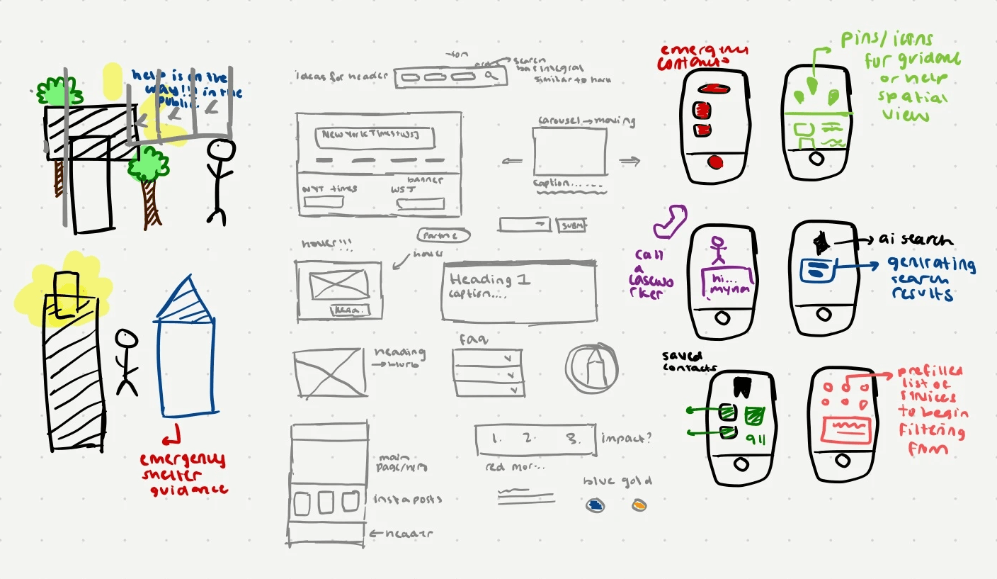
Ideation
Through collaborative brainstorming, I sketched low-fidelity solutions across three different mediums: physical devices, web services, and mobile services. This early, cross-platform exploration helped our team visualize and compare diverse approaches to solving the core user need.

Bridging the Gap Between Design and Code
To ensure smooth implementation, I created comprehensive documentation including annotated screens with design rationale from our iterative testing, development-ready assets with clear naming conventions, and detailed accessibility specifications for WCAG AA compliance (color contrast ratios, touch target sizes, screen reader labels, and focus order).
Our Final Solution
These prototypes brings all the solutions together into a single, cohesive experience. Our design and user flow is intentionally simple, prioritizing speed, visual accessibility, and clarity to meet the needs of a user in crisis.
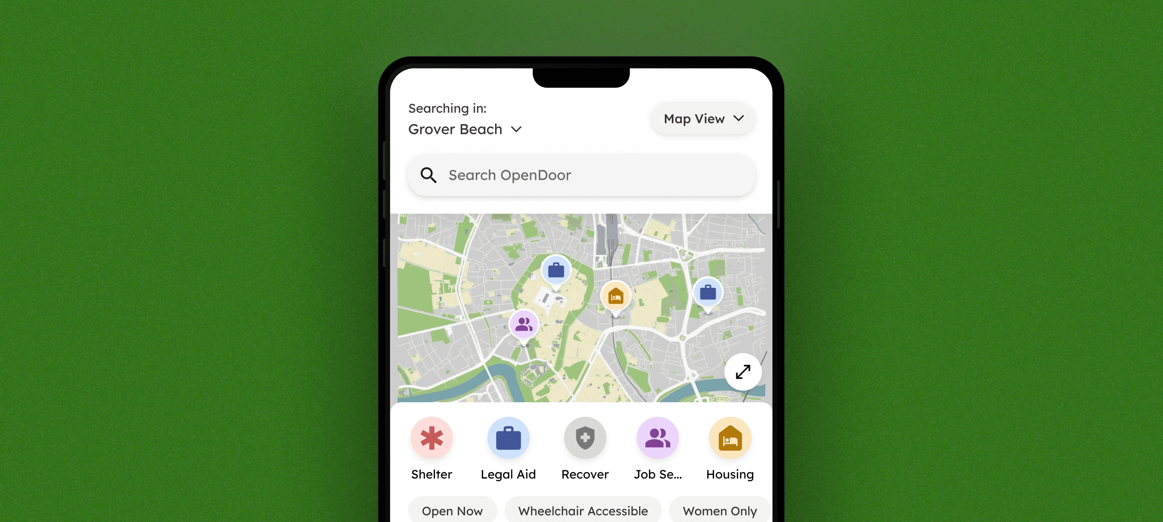
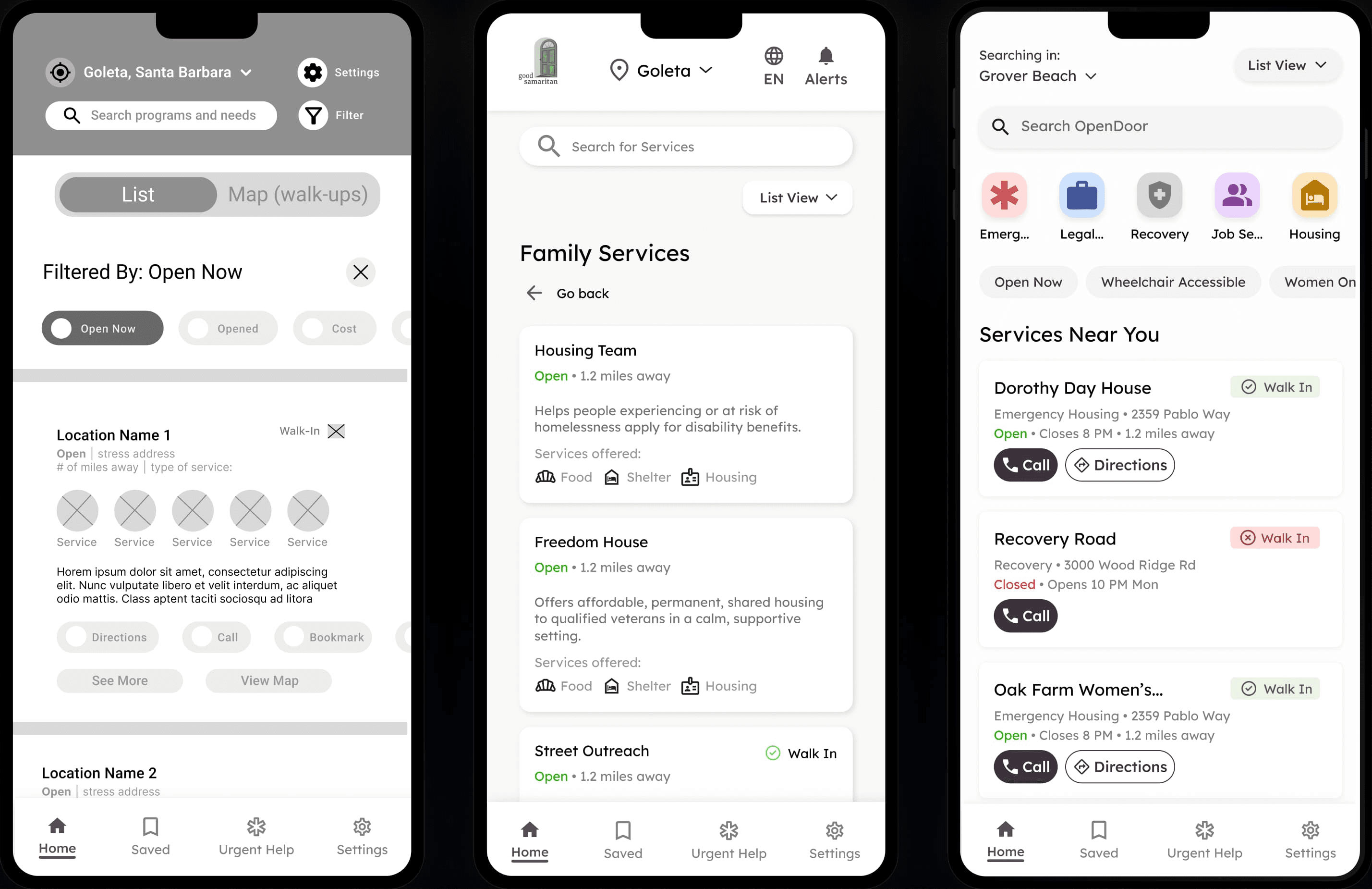
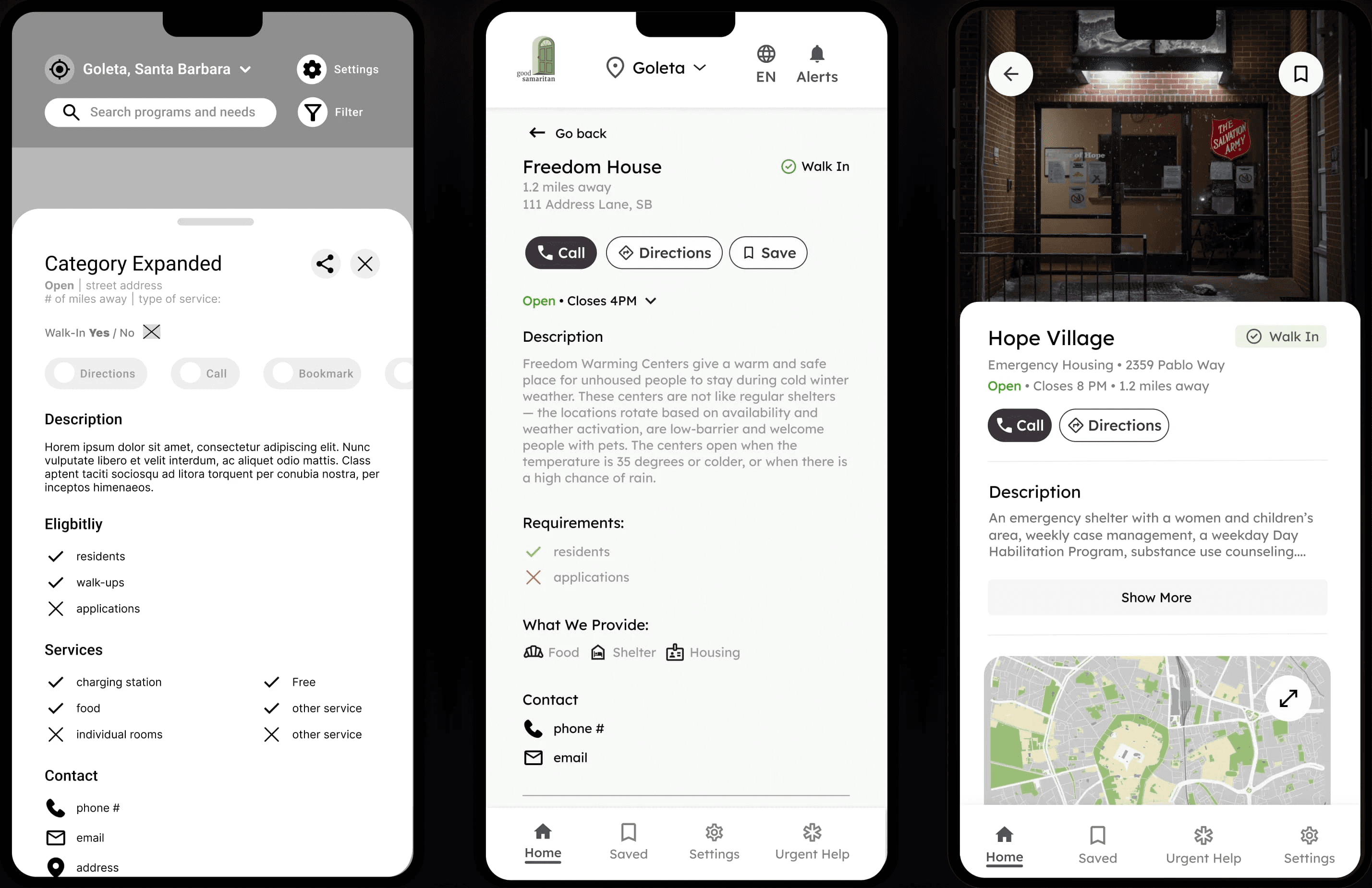
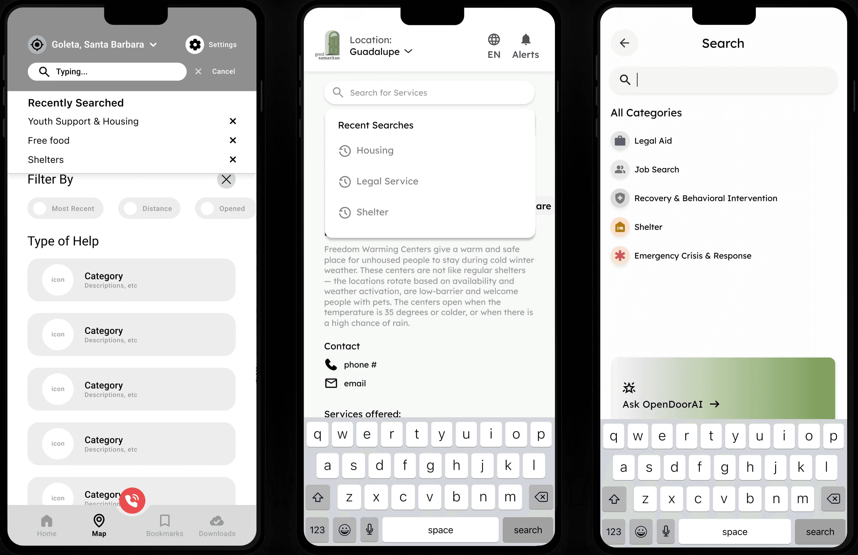
The Core Discovery Flow
This prototype validates the core user flow, from searching and filtering resources on the list view to viewing expanded service details and saving it for later access.
NLP-Assisted Search
This prototype tests the conversational, AI-driven search flow. From the Map view, users tap the search bar, choose “Conversational Search,” and ask for help naturally (e.g., “I need a place to sleep tonight”). The system then returns the most relevant services, bypassing traditional filters.
Low-Data/Offline Mode
This prototype demonstrates how the app supports users with limited or no internet access. When “Low-Data Mode” is enabled in Settings, the app switches to a list-only view showing cached service data. The UI then directs users to their locally stored “Saved Resources,” accessible even offline.
Expanding to LA and Boston
Building on our initial success, our Project Manager, Diya Shreedar, had the vision to scale this app. We are actively piloting in Los Angeles and Boston and our work has been recognized with a $10,000 cash prize from Equitech Ventures, backed by Amazon Web Services through the Harvard Grid AI startup incubator.
Key Takeaways
I Learned to Advocate for Users Often Overlooked by Technology
My most important lesson was advocating for a user group that is traditionally overlooked by technology. We were designing for individuals in crisis with varying levels of tech literacy. This meant user-centered design was incredibly important. Every decision, from the NLP search to the offline-mode, was an opportunity to advocate for their needs to our clients and ensure the experience was inclusive.
I Better Understood the Importance of Cross-Functional Collaboration
Our breakthroughs didn't happen in a silo; they came from bouncing ideas off each other and gaining different perspectives from our entire team. Working directly with engineers, our product manager, and user researchers challenged my assumptions and ultimately pushed our designs from "good" to user-centric.