Berkeleytime Notifications
At Berkeley, courses often fill quickly, leaving students unsure when to act. Without alerts, students must constantly monitor enrollment pages to catch openings as classes fill up during Phase 1 and Phase 2 registration. To address this, I designed the core MVP and led a team to build a notification feature for Berkeleytime, UC Berkeley's largest course discovery platform, allowing students to respond immediately when key enrollment milestones are reached.
Role
Frontend Lead
Timeline
Sep 2025 - Dec 2025
Team
1 Frontend Lead
1 Backend Lead
1 User Researcher
3 Engineers
Tools
Figma
Visual Studio Code
Github
Problem
How might we help UC Berkeley students make informed enrollment decisions despite limited and rapidly changing course availability?
Impact
Set to publicly launch in Spring 2026
We estimate it will help 50k+ students make more informed course enrollment decisions.
Course Enrollment is an Inefficient Process
With over 30,000 undergraduates competing for limited spots in high-demand classes, UC Berkeley’s enrollment process is often stressful. During Phase 1 and Phase 2, many students lack visibility into how quickly classes are filling due to the absence of live enrollment updates. As a result, students repeatedly refresh enrollment pages to monitor availability, creating a time-consuming and inefficient process that increases stress and uncertainty.

Current Challenges in Course Enrollment
I collaborated with our user researcher to analyze 167 survey responses and conduct 6 interviews, uncovering Berkeley students’ key challenges with course enrollment.
78% of students manually refresh enrollment portals multiple times a day during course enrollment period
During Phase 1 and Phase 2 enrollment, seats in high-demand classes often open only briefly before filling again. This constant monitoring highlights a lack of real-time visibility into seat availability, increasing cognitive load and uncertainty.
61% of surveyed students said their biggest course enrollment challenge was was getting into their desired classes.
Without threshold alerts, students have no early signal that a class is nearing capacity and often only realize the urgency once enrollment reaches 90% or the class has already closed.
55% of surveyed students review historical enrollment trends before course enrollment
Many students research enrollment patterns ahead of time to predict which classes will fill quickly and which can be enrolled in later because they lack live feedback regarding current enrollment.
Meet Alexis
Alexis, one of 30,000+ UC Berkeley undergraduates competing for limited seats in high-demand classes, relies on Berkeleytime to plan her schedule. When a class reaches capacity, she’s forced to constantly refresh enrollment pages to monitor seat availability, a tedious, inefficient process that is stressful and makes enrollment feel like a race rather than a plan. Her experience highlights the challenges many students face in navigating a system with limited real-time visibility.

Framing the Product Opportunity
How might we help UC Berkeley students make informed enrollment decisions despite limited and rapidly changing course availability?


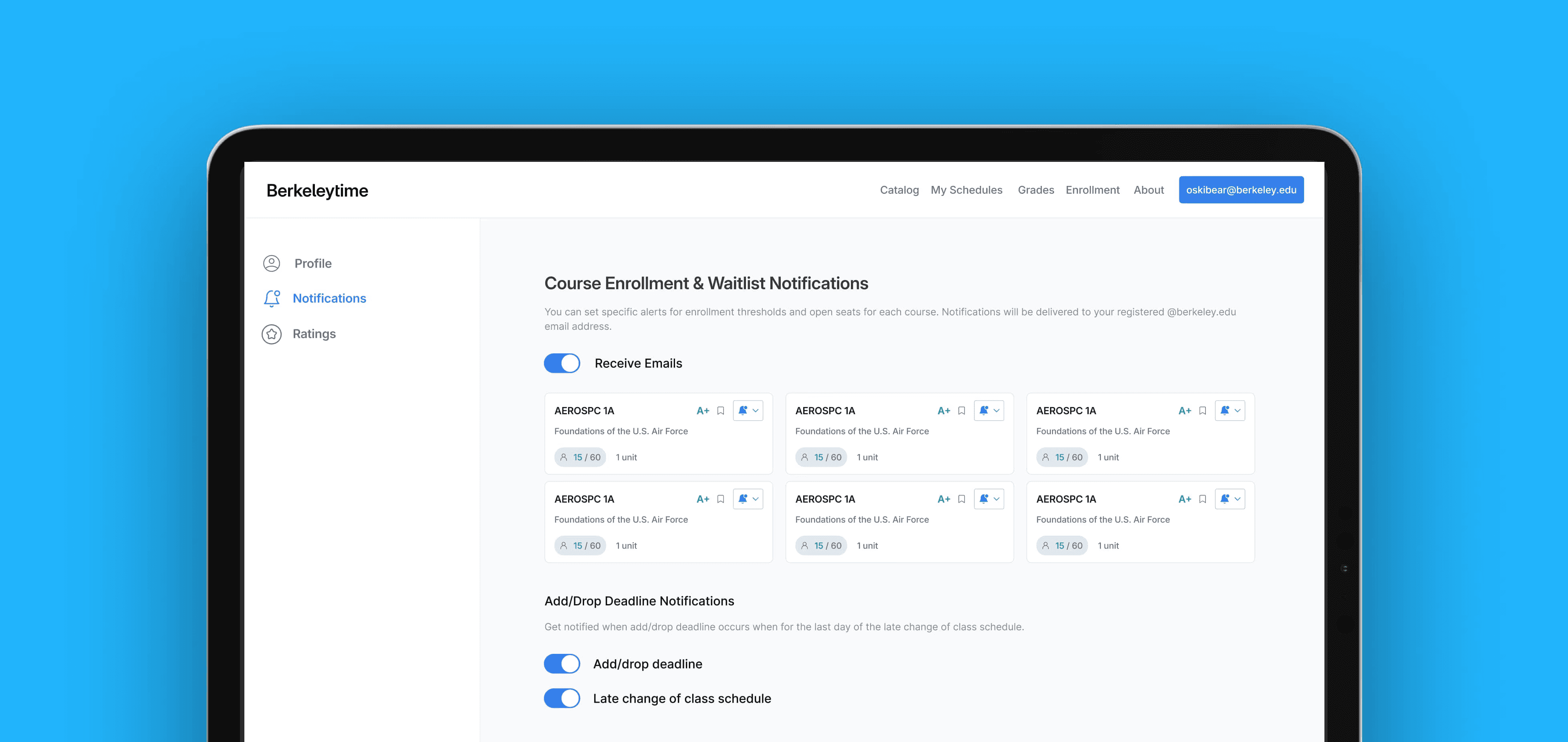
Final Prototype
Looking Back
Leading with Clarity and a Collaborative Mindset
I learned that good leadership comes less from directing decisions and more from creating an environment where people feel comfortable asking questions. Taking the time to address questions, and making sure teammates have the tools and context they needed fostered an open and supportive team culture, ultimately building team trust.
Bridging Design and Code
Working directly in code gave me a deeper understanding of which design decisions actually work and which interactions break down in practice. Seeing my designs come to life through code, and debugging when they didn’t, made me a more grounded, intentional designer and sparked a deeper appreciation for engineering as a core part of the design process.