
Reducing Repetitive IT Support Requests with AI Search
UC Berkeley serves over 45,000 students, with the Registrar’s Office acting as a central hub for enrollment, records, and administrative support. Operating within the Berkeley IT ecosystem, the office handles a high volume of student inquiries while still needing to provide personalized support. Our goal was to introduce an AI-powered self-service search layer to deflect routine questions, allowing staff to focus on more complex student needs and shift from reactive support to proactive service.
Timeline
Jun 2025 - Aug 2025
Team
2 Product Design Interns
1 Project Manager
2 Engineers
Tools
Figma
Miro
User Testing
My Role
I partnered with another Product Design Intern to lead the end-to-end design of the AI search experience. We worked from early discovery through high-fidelity prototyping, collaborating closely to ensure the solution fit seamlessly within Berkeley IT’s existing systems. Along the way, I focused on user research, interaction design, and stakeholder alignment.
Impact
In usability testing with 7 participants, the AI search experience reduced average time to find answers by ~40% compared to the existing support flow,
Identified limitations of AI search in high-stakes administrative contexts and designed guardrails to mitigate risk
An Overview
A Case of Administrative Burnout
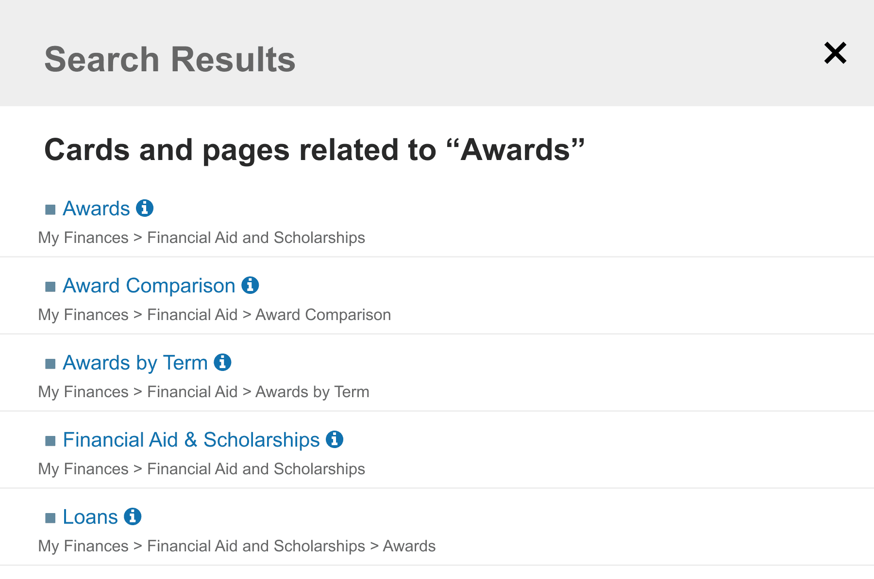
UC Berkeley’s student dashboard contains critical academic and administrative information, but unclear navigation and a weak information hierarchy make it difficult to discover. As a result, students frequently contact the Registrar by email or phone for routine questions, creating a support bottleneck that delays responses to time-sensitive issues such as financial aid holds and enrollment problems.
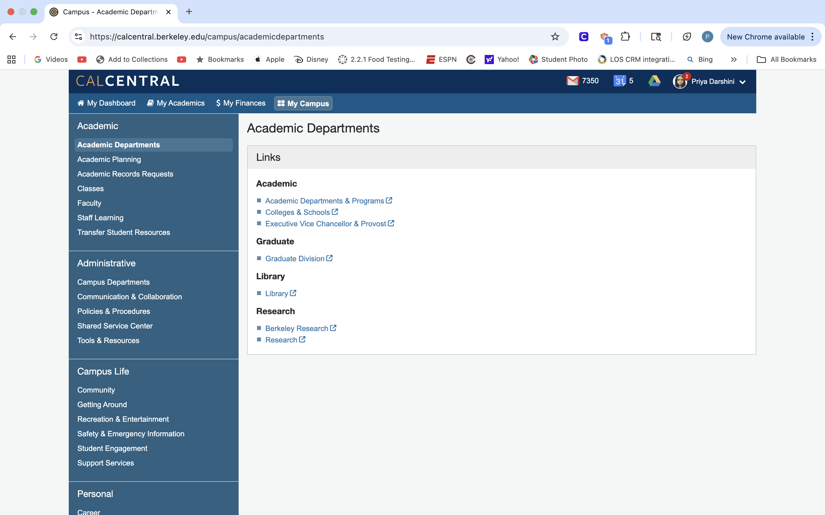
FIG 1: THE DASHBOARD REQUIRES STUDENTS TO SCAN MULTIPLE CATEGORIES TO FIND INFO.
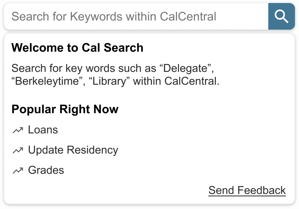
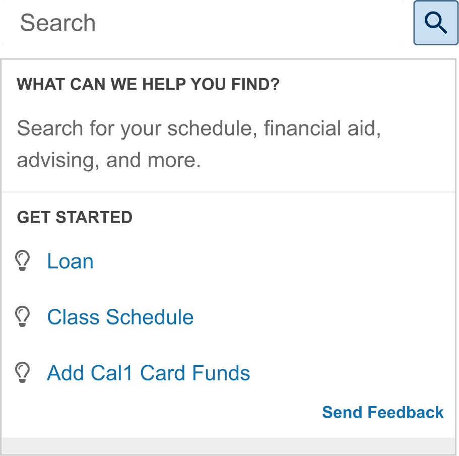
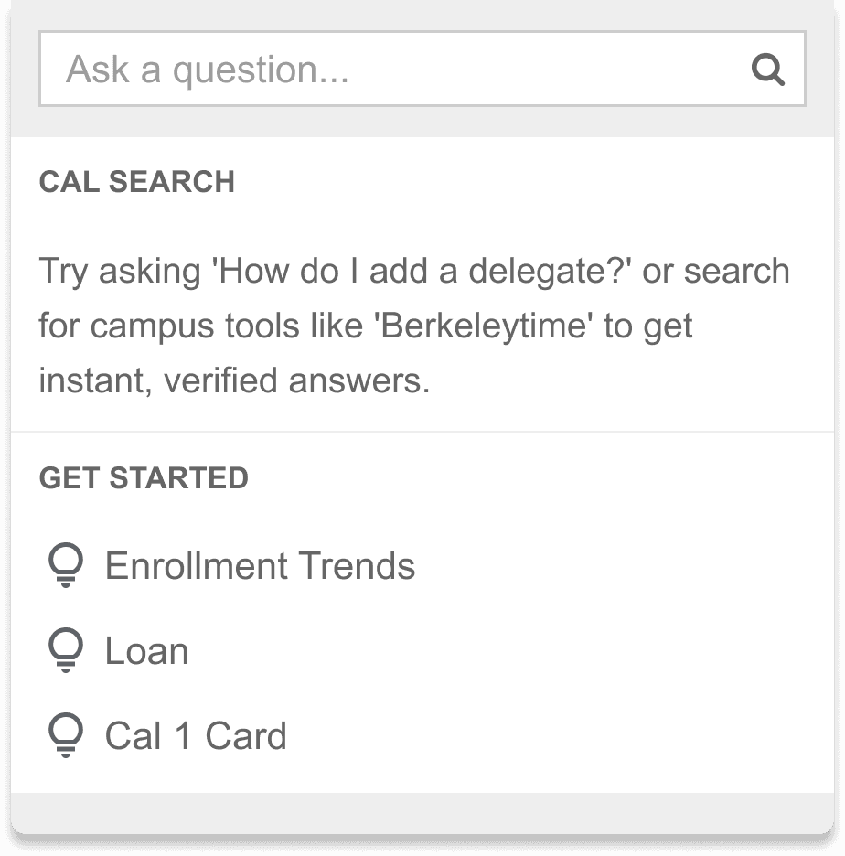
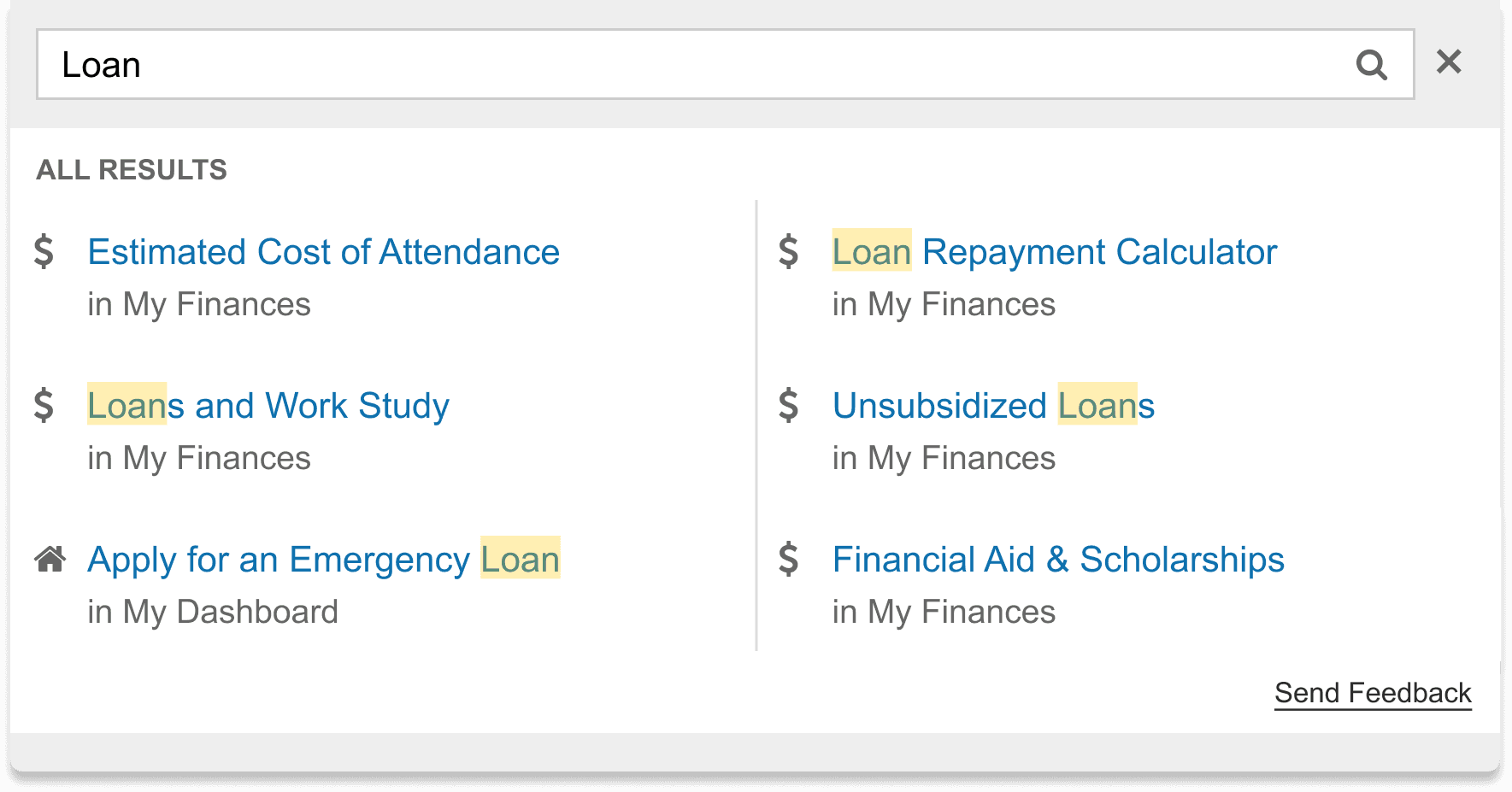
Designing for AI Transparency and Trust
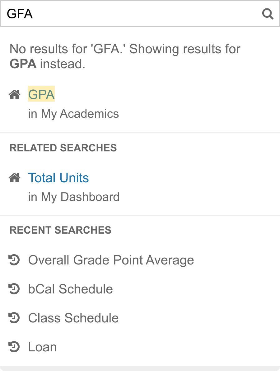
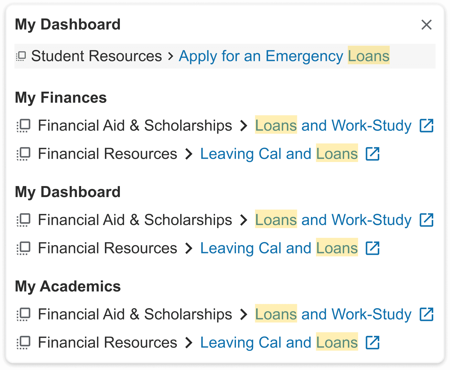
To avoid a “black box” experience, I designed the underlying system logic alongside the UI, ensuring responses were grounded in authoritative sources and clear next steps. The experience proactively handled ambiguous queries, routed requests through verified policy and student data sources, and surfaced contextual actions rather than isolated links, reducing dead ends and enabling students to resolve common issues quickly without staff intervention.

User Research and Synthesis
To better understand how students discover and access critical information, we conducted interviews with 14 UC Berkeley students, examining how navigation and information hierarchy impact their ability to find answers independently to routine academic and administrative questions
Students Are Unaware of Existing Information in the Student Dashboard
Students are often unaware that the student dashboard contains answers to common questions, policies, deadlines. As a result, they contact the Registrar for support even when the information already exists within the dashboard.
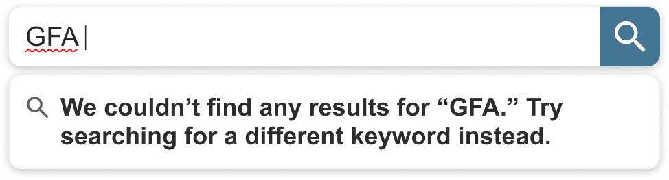
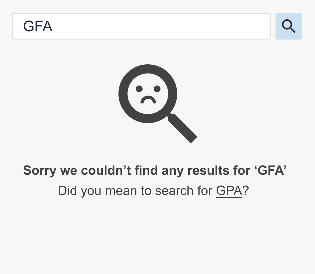
Mismatch Between Student Language and Dashboard Terminology
Students search using everyday language, while the dashboard uses official campus terminology. The mismatch causes them to struggle with search and they default to contact the Registrar for help.
High Volumes of Routine Inquiries Delay Time-Sensitive Support
Registrar staff reported that approximately 60% of incoming requests concern routine questions such as deadlines or links. This volume reduces visibility and response speed for more time-sensitive cases.
Key User Persona
Eva represents a common Berkeley student archetype: busy, capable, and unfamiliar with institutional jargon. Through her needs, we observed that students and the university speak two different languages: students ask questions in plain English (“I’m sick, what do I do?”), while the university organizes information by official codes (“Medical Withdrawal Policy”), making the AI’s most important role not link retrieval but real-time translation of student intent into the correct campus answers.

Competitive Analysis
I audited 'answer engines' like Perplexity and enterprise search tools like Glean and identified that trust breaks down when AI operates as a black box, highlighting the need for verifiable, citation-backed answers that clearly show students like Eva where information comes from.

Ideation
Guided by our user research and competitive insights, we explored ways to translate student questions into verified answers, prioritizing clarity, trust, and ambiguity over opaque, black-box AI behavior.


Final Prototypes
Reflections
Working Around Technical Constraints & Limitations
Working closely with engineers reinforced how infrastructure constraints shape AI product decisions. Given data reliability requirements and the risks of hallucination in a high-stakes institutional context, we intentionally avoided deploying a fully generative chatbot or agent. Instead, we designed a retrieval-based AI search experience grounded in verified sources, allowing us to balance performance, accuracy, and trust.
Designing AI for Institutions Where Trust and Privacy Especially Matter
In institutional settings, AI operates in a high-stakes environments where errors, ambiguity, or unclear data sources can quickly erode user trust. Through this project, I learned that designing for trust requires transparency around where information comes from, clear boundaries on what the system can and cannot answer, and handling of sensitive student data.